E-Commerce Responsive Web
Online Checkout Redesign
A redesign of cart & checkout for Costco to streamline the member journey and improve known usability issues.
Impacted Sites
costco.com
costco.ca

Project Overview
Originating from our E-commerce VP, the request was to deliver a concept within two-weeks to review with a small group of executives with various UX improvements.
This marked the first redesign to help kick off a series of projects aimed at refreshing and modernizing the sites, following the previous redesign that was done in 2015.
Business Problems & Opportunities
- Evaluate single-page, multi-page, and “express” use cases
- Reduce support costs through usability and bug fixes
- Optimize up-selling and cross-selling opportunities
- Provide clear and transparent fulfillment and pricing details
- Leverage current site framework to minimize technical debt
Primary Project Team
- Project Managers (2)
- UX Designers (myself)
- Business Analysts (4)
- Developers (many)
- Quality Assurance (many)
Stakeholders
- eComm Executives
- Product Owner
- Customer Support Leadership
- Key Business Areas
Role & UX Challenges
My Role
As the group of senior UX designers, upon receiving this request, we quickly mobilized to define the best path forward. Eager to steer the team forward following discussions with my teammates and manager, I was assigned the lead role for the project.
- Led senior designers in understanding the problem space
- Analyzed recommendations from UX, analytics, and SEO teams
- Guided the team through iterative phases: sketching, feature voting, prototyping, and creating hi-fi designs
- Prepared with designers for stakeholder reviews and obtained sign-off
- Continued work post-stakeholder approval, uncovering remaining use and edge cases
- Assisted with requirements and conducted design reviews with the project team and stakeholders
- Provided end-to-end project delivery and support
Tools Used
- Sketch
- Invision
- Figma & Figjam
- usertesting.com
- Baymard Institute
- Microsoft Azure
- Google Suite
UX Challenges
No project team or requirements at project start
Our project began as an “unofficial” initiative, lacking a formal team or defined requirements. At some point after designs had been approved, analysts joined the team to create user stories based on designs. Some requirements were missed with this practice and required me to revisit stories to add more details or to have an analyst to dig into technical requirements outside of the scope I could provide from UX.
Documentation was lacking for front-end architecture & use cases
Additionally, documentation on use cases and functionality of checkout was unavailable or disparate. I took a proactive approach running through production and reaching out to various departments for questions, documenting every use case and then defined a new front-end architecture as they pertained to cart & checkout. This hands-on approach allowed myself (and the project team once it was created) to establish a foundation for the project amid initial uncertainties and lack of structured documentation.
Short timeline limited ability to gather qualitative user-based research
Due to a two-week timeline for stakeholder approval on a primary design, and a few more weeks to capture remaining use & edge cases, the ability to conduct qualitative research was going to be limited and so reliance on quantitative research from our analytics team, and recently conducted research by the UX team was necessary.
New styles & design system was inlux and wasn’t clearly defined during this project
Our design system was undergoing significant growth, and finalizing new styles proved to be a dynamic process as other redesign projects were initiated. Close collaboration within the UX team was crucial to ensure alignment with the evolving styles and updates.
Post-Project Design Updates
As the project progressed through development and testing, I felt there was a better design for Costco and I began exploring other concepts based on additional research and exploration. My intent was to create continuous improvement upon the completion of this project, polishing the visual design of cart and checkout, and improving upon interactions and information that would be useful to users.
If I approached this project differently, I would have taken a bigger risk and pushed the boundaries I was operating within. I believe some of this was due to the time constraints and limitations of the project, and acceptance of my own responsibility, I’ve since learned to be comfortable pushing the boundaries, and being able to break out of a design system or the “let’s be safe” perspective in order to explore solutions that exist outside the box.
Go to My Lessons & Growth section to view post-project design concepts I explored.

How Solutions were Determined
UX Approach
Given the two week timeline, it was important for the group of us to quickly align in our approach. I took on the task of defining a clear path forward and proposed the following:
- Rapid review of recently conducted UX research along with insights from analytics
- Design workshops, with a mobile-first approach, exploring various concepts within the UX team
- Technical review with our engineer and lead developer
- Final design proposal for stakeholder reviews
- Detailed documentation of architecture and use cases for the technical team to consume
Exploring Research & Opportunities
UX Competitive Analysis – Checkout Steps
One of the pieces of researched we referenced was put together a few months prior by a few UX designers looking into desktop and mobile experiences for the number checkout steps required to place any order with a handful of Costco’s major competitors. This was important to stakeholders as they were exploring ways to shorten Costco’s checkout, often using Amazon as a reference point, to streamline the member journey.
A few years prior, we had introduced an “express checkout” for members who had saved default information and provided a tap or two to complete a purchase. Considering the research and stakeholder interest I, along with the rest of the designers comparing with our competitors, saw an opportunity possibly building express checkout as an option for the main checkout journey.
Merkle Analytics – Checkout Funnel
The other key piece of research we utilized was our checkout funnel and member journey, particularly addressing issues where drop-offs occurred during checkout, provided by Merkle. While I cannot disclose specific data points, we observed a significant drop-off between cart and step 1 in checkout, due to sign in/register step that is required to checkout. Once users committed past this step there was a remarkably high order placement rate who continued through the journey. Notably, approximately 50% of checkout traffic originated from desktop devices, with the remaining 50% from mobile or tablets.
This aligns with typical online shopping behavior, where users frequently navigate between the cart and checkout to verify shipping costs, taxes, and discounts. The iterative process of pogo-sticking back and forth is common until users are ready to commit and place an order.
It’s important to note that while users do not need to have a membership to checkout, they must have an account online. For this project, updates to Sign In/Register was out of scope.

Merkle Analytics – Competitive Analysis & User Behavior Tracking
Merkle provided their own retail analysis in conjunction with specific areas of improvement they were proposing to our sites. While there were some recommendations we knew about and wanted to fix, Merkle provided a great detailed analysis of areas UX was not aware of that proved proved incredibly valuable.
I’m unable to display a full list of recommendations, however there were some clear areas in cart and checkout we needed to address:
- Addressing the architecture and layout within cart to improve utilization of space, interactions such as shipping methods and costs, and bringing key pieces of information above the fold that previously required scrolling to view.
- Improving shipping address form behaviors within checkout to decrease usability issues and incorrect addresses.
- Improving payment method components that provide clarity on available options and details on applied shop cards.
- Mobile-first thinking when it comes to primary actions, secondary interactions, and touch targets
Design Sessions & Documentation
UX Design Sessions (Happy Path)
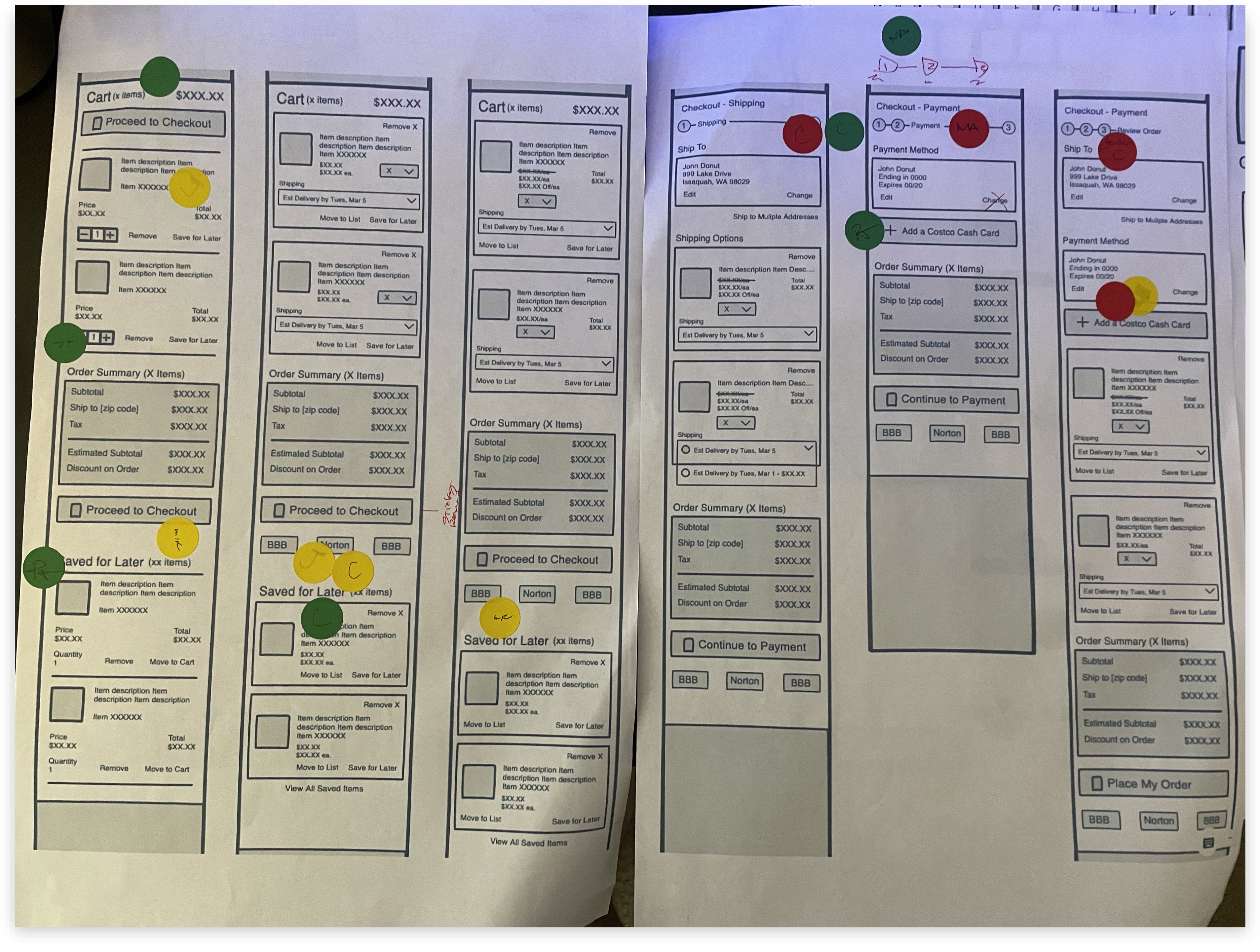
In order to help streamline getting to a concept we were happy with, I suggested the group of us designers quickly iterate through conceptual ideas, first by sketching and creating lo-fi concepts, and then moving to a mid-fi concept where we would vote on features we felt solved problems well vs. those we did not feel they solved the problem well, or may be better suited for back-log.
I suggested we print off our work and posted on nearby walls we could gather around as we each presented our concepts, allowing us to step away from our computers and focus on the concepts themselves with distractions.
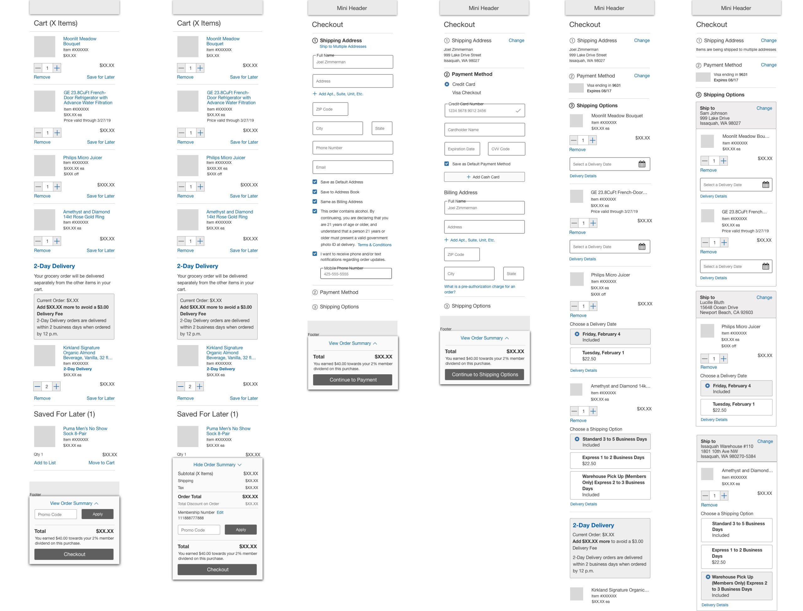
After voting on features, I along with a teammate built two mid-fi concepts, with one concept as our final recommendation for stakeholders, and another with additional options if we needed to share based on how stakeholder discussions go.
User Journey & Interaction Mapping
After the front-load of project work from research and concepts, I moved forward on documenting additional use cases, the various areas members are able to add items to cart, and where they are coming from within our eco-system.
My documentation also included interactions and how they relate throughout cart & checkout. This helped provide a high-level overview of the front-end for our technical teams during development and QA.
Information Architecture
In addition to mapping the journey and interactions, I also documented, for the first time amongst our team, the page structures and components for Cart & Checkout. This was critical in discussing the function and order of checkout with other designers who were working on smaller stories, and to our technical team to support their work.
Additional Designs & Use Cases
After defining the happy path and documenting the front-end architecture and interactions, I worked on completing the rest of the use cases (~25 variants and states), based on specific items being purchased, along with components and their varying states through the member journey.

How Designs Solved Business & User Problems
Cart Improvements
Our initial cart design concepts were primarily geared towards mobile devices, driven by stakeholder request for design reviews. We focused on establishing content hierarchy and adaptable patterns to cater to mobile devices, however, I recognized the need to revisit our approach for desktop and larger devices to ensure optimal content representation.
While the group concentrated primarily on refining the checkout flow, a colleague and I worked on cart sketches, largely aligning with Merkle’s recommendations. Though finer component details and placement would need to be defined outside of sketches, our direction mirrored current trends and research insights, emphasizing key information placement and usability enhancements.
Previous Cart Design (2015)

Cart Example from Design Sessions
Cart Example from Design Sessions
Final Concept
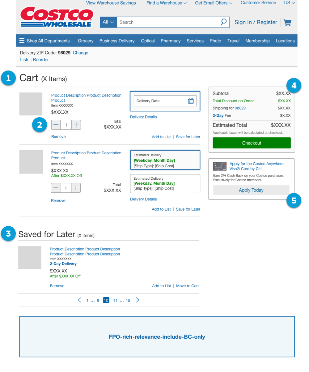
The final cart concept I pulled together after UX team feedback and feature voting. My goal was to make the best use of the space for larger displays, bringing together our intent to make key interactions and decision points stand out and provide clarity and weight for users, while providing opportunities for the business to upsell when needed or wanted.
1. Improved Architecture & Space Utilization
- Addressed content inconsistencies by defining hierarchy and placement of content, fixing data triggers (i.e. ZIP & Postal Codes with estimated shipping costs), and defining correct use and locations of global and item-level notifications
- Optimized visual design using smaller font sizes and spacing, aligning to a 4pt/8pt system
2. Updated Quantity Input
- Adapted quantity selector to use “plus” and “minus” buttons that were being used within Costco Grocery, as well as allowing keyboard input for consistency and to reduce user errors based on item inventory availability or item rules
- Moved error messaging directly under the component to display item level errors that require user input
3. Introduced Save for Later
- Implemented Save for Later feature within cart itself to align with competitors and allow users to view their list without visiting “My Lists” within a user’s account
- While we explored some different concepts, to streamline the new feature working with engineering, we opted to simply utilize the same design used for item line-items, with an intent to evolve the pattern based on future user analytics
- Implemented pagination to optimize performance vs. a “load more” pattern which concerned stakeholders and engineering regarding potential performance & load issues
4. Moved Order Summary & Checkout Button Above Fold (Desktop)
- Moved Order Summary and Checkout button to top right for desktop and tablets so information was “above the fold”, and follows users as they scroll down the page
5. Added Credit Card Upsell
- Placed credit card upsell component under the Order Summary in cart to promote white-label credit card without disrupting checkout flow for users, and is an additional location for the business to increase credit card sign-ups
Additional Cart Improvements
Sticky Primary Buttons for Mobile
Implemented a sticky button feature for both the “Checkout” button in the cart and the “Place Order” button in the checkout process, specifically designed for small devices. This enhancement ensured that the primary call-to-action remained prominently visible to the user as they scrolled through the cart and checkout screens. By keeping these important buttons fixed in position, I aimed to make clear the call-to-action was always available on smaller devices, especially when users may have larger orders and can avoid scrolling.
Sticky Button Concept
I was the only designer who explored concepts that brought the order summary together with the primary action as a sticky component. After UX and accessibility reviews it was determined too complicated for users and development but could be explored later with more user insights and analytics.
Final Sticky Button Component
To simplify the component for launch, it was determined to show only the Estimated Total (or Order Total in Checkout) and the primary button. The order summary would display on the page normally.
Added Warranty Upsell for Items
- Implemented MVP design to analyze if pattern was useful for users who may have forgot or weren’t aware an item had a warranty available when adding to cart, as well to determine if business stakeholders would use the feature
Redesigned Delivery Options
I’m excited about the design of this feature as it was an idea I had brought up thinking about mobile devices and touch targets, and wanted to improve upon radio buttons. The UX team agreed during our design sessions. The original designs of options utilized a simple radio button group with basic information on when to expect an item and the cost. Some items had rules for other options that used terminology common in the industry but from a user perspective, would be unclear and no additional information would be displayed, forcing users to go back to the PDP or customer support documentation.
Original Delivery Options (2015)

Delivery Options Concepts Explored
The visual designs underwent iterative refinement based on stakeholder requests and insights gleaned from other business units adopting the new components. This enabled me to ensure alignment with both business and user objectives, enhancing the clarity and transparency of shipping options and details by delivering the precise level of information expected by customers.
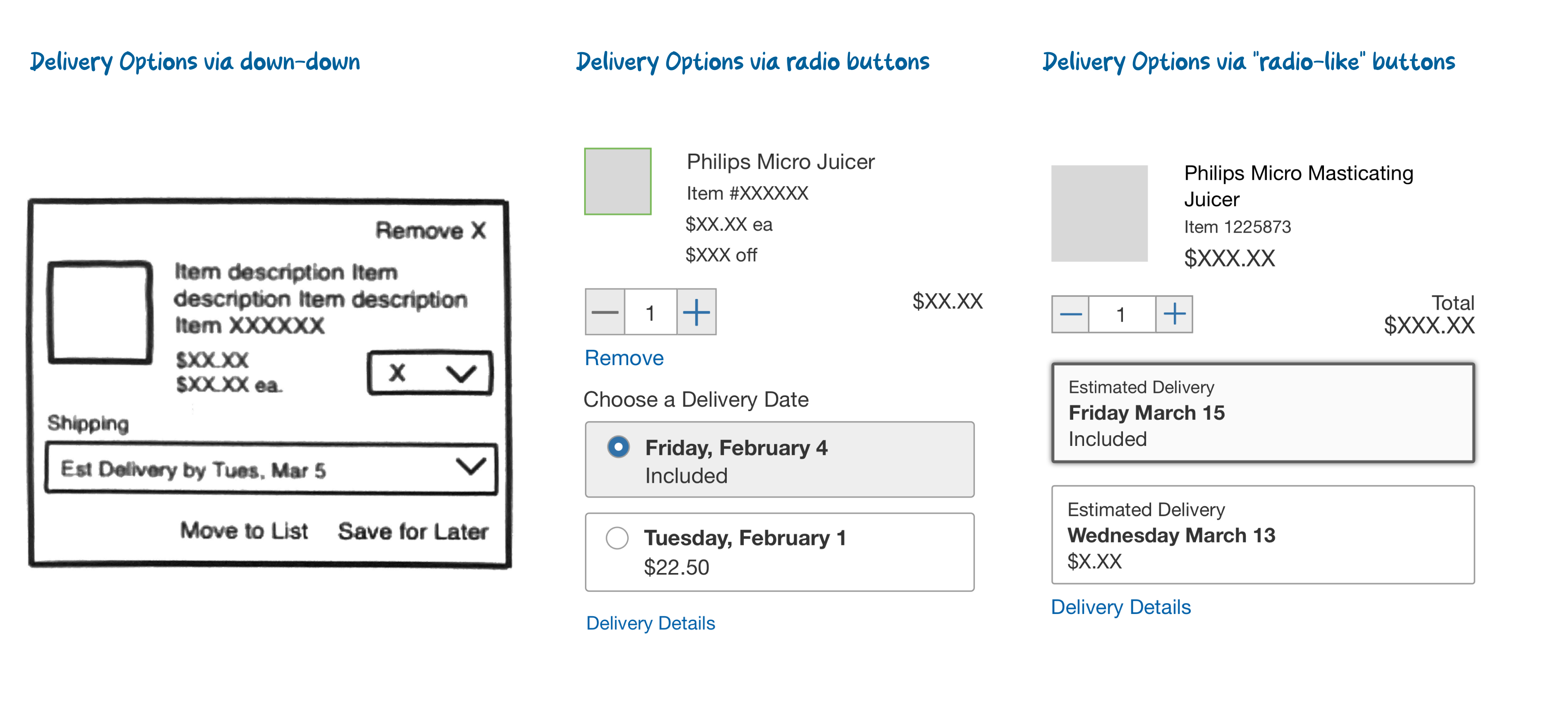
Final Delivery Options Designs
As stakeholders and other projects embraced delivery options, feedback empowered our UX team to refine the visual design. Simultaneously, the business recognized the significance of providing tailored information for specific options, enhancing the user experience beyond the reliance on FAQ or customer service documentation for understanding.
This is a concept I wanted to improve upon, after working with one of our accessibility analysts. While the pattern was well received by stakeholders and users, I believe going back to an earlier concept where radio buttons are displayed within each option, potentially with additional visual feedback such as checkmark for a selected option.
Checkout Journey
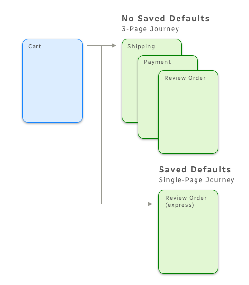
The original checkout was a four-step multi-page journey. We knew people were struggling at certain points in the checkout and multiple pages increased opportunities for usability issues. Additionally, we had an “express” checkout feature for customers who were signed in and had default information saved for checkout, that would take users to the “Review Order” page, one step away from completing checkout.
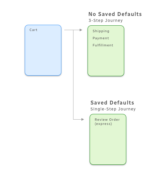
As express checkout was a high-value feature from our major VP stakeholders, we realized the potential for a single-page checkout and the value it would bring to customers.
2015 Checkout Multi-Page Journey
The 2015 version of checkout consisted of cart and a multi-page journey through Shipping, Payment, and reviewing order and fulfillment options. If customers had default information saved, they would have an option for “Express Checkout” within Cart which would take them to the last step before placing an order.
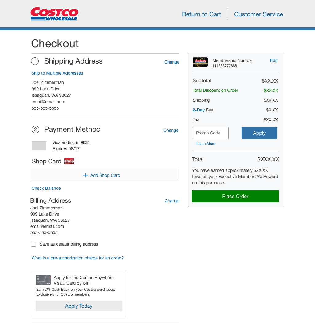
2019 Checkout Single-Page Journey
The 2019 version of checkout, knowing most customers (~80%) had default information saved, merged pages and express into a single page process. If users had saved default information, they were in a state to “place order” immediately. Any missing default information checkout would send users to the step requiring user input.
Checkout Solutions
Shipping Address
Our original forms were designed as “label-over-input.” To trim down the amount of space this takes on longer forms, we opted for material design inputs which is designed as “label-in-input.” This was a big change as well as this was the point our team transitioned to a 4pt/8pt design system.
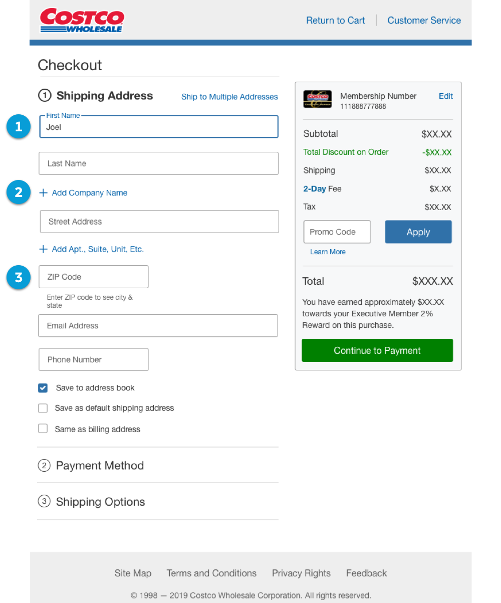
1. Material Design Inputs & Vertical Space
Our original forms were designed as “label-over-input.” To trim down the amount of space this takes on longer forms, we opted for material design inputs which is designed as “label-in-input.” This was a big change as well as this was the point our team transitioned to a 4pt/8pt design system.
2. Minimize Secondary Inputs
Recommended by Merkle and also known that users were attempting to add information within inputs that were not necessary, we attempted to hide secondary information behind links that would expand inputs if needed.
While we were attempting to help reduce usability issues, business requested after launch to always display all inputs because they were getting customer feedback those inputs were being missed during checkout and causing some address problems for customer service and customers.
3. ZIP/Postal Code auto displays City and State
Originally, users were required to input City, State, and ZIP/Postal Code and was causing some problems as sometimes this information was mismatched. As we saw from our research, and from Merkle based on their user heat maps and analysis, I placed ZIP/Postal Code as the primary input, which would then auto-display the City and State (or City and Province in Canada).
Payment Methods
In our legacy checkout, we found that users were not able to see additional payment options aside from Credit or Debit Card selection. This was due to content residing under each radio button selection. With Credit or Debit Card as the default selection with the form displayed below, it pushed other options lower on the page. We saw through Merkle’s analysis user attention was missing the additional payment option.
Original Payment Methods Design (2015)
Our original forms were designed as “label-over-input.” To trim down the amount of space this takes on longer forms, we opted for material design inputs which is designed as “label-in-input.” This was a big change as well as this was the point our team transitioned to a 4pt/8pt design system.
Payment Method Selection Concepts Explored
The visual designs underwent iterative refinement based on stakeholder requests and insights gleaned from other business units adopting the new components. This enabled me to ensure alignment with both business and user objectives, enhancing the clarity and transparency of shipping options and details by delivering the precise level of information expected by customers.
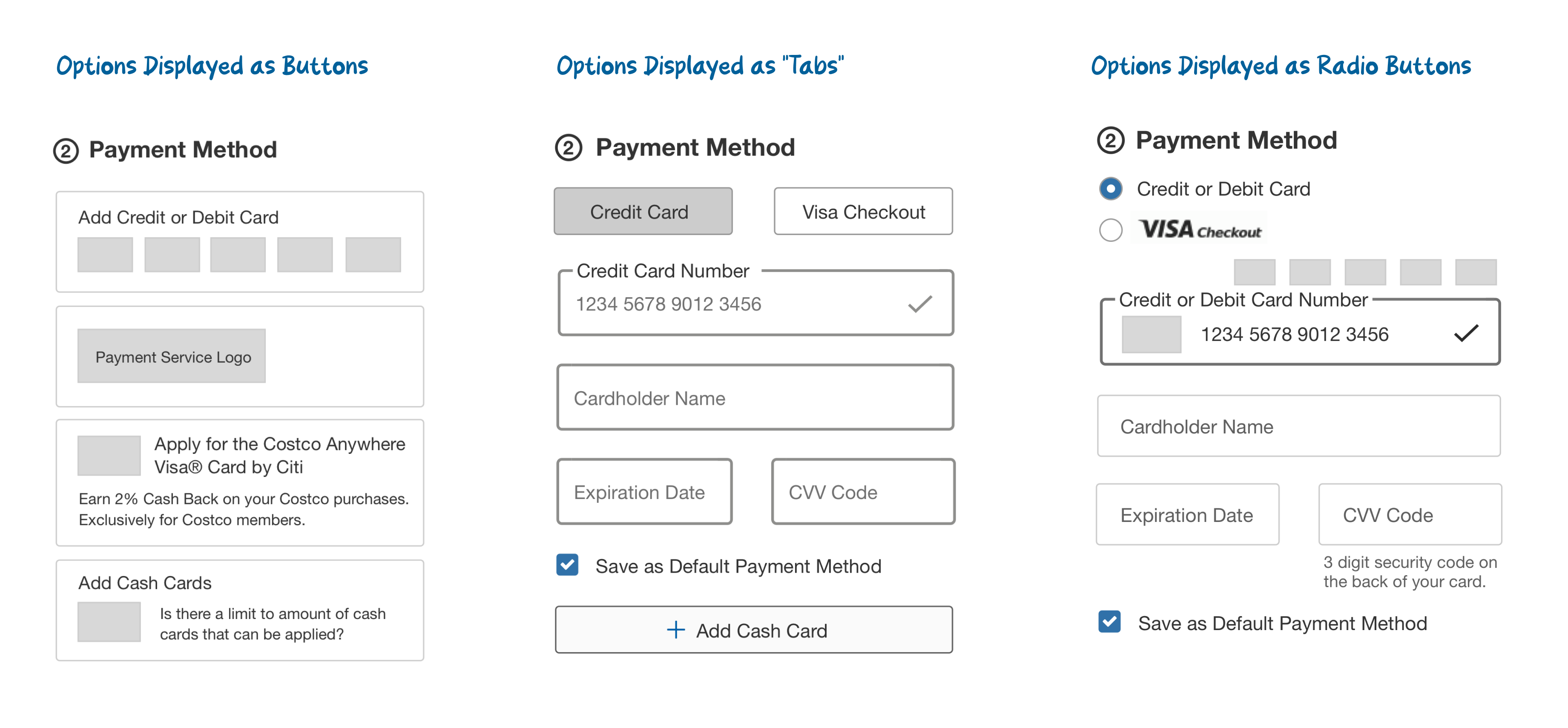
Final Payment Methods Designs
To resolve this usability issue, it was proposed to keep radio button selection, but to group options together and progressively displaying content.
The other issue we wanted to resolve, and was a user story managed by my teammate, was regarding the “Click to Pay” icon that has no label. This was unclear to us in UX, and we knew this wouldn’t make sense to users. This icon is part of the global payment organization that oversees a simplified approach to paying across multiple credit card companies. We did push back frequently on adding additional language for this option to help users but we were met with hard resistance as those changes would go against their own design system rules and we were forced to keep it as is.
Improved Shop Card Component
We implemented several enhancements to Shop Cards, including displaying the amounts applied per card, remaining balance, offering the option to remove cards if needed, and enabling users to conveniently check the balance of their cards directly within the checkout flow. These enhancements not only simplified the process of using shop cards but also instilled confidence in users by providing them with real-time visibility into the applied amounts and available balances.

Shipping Options
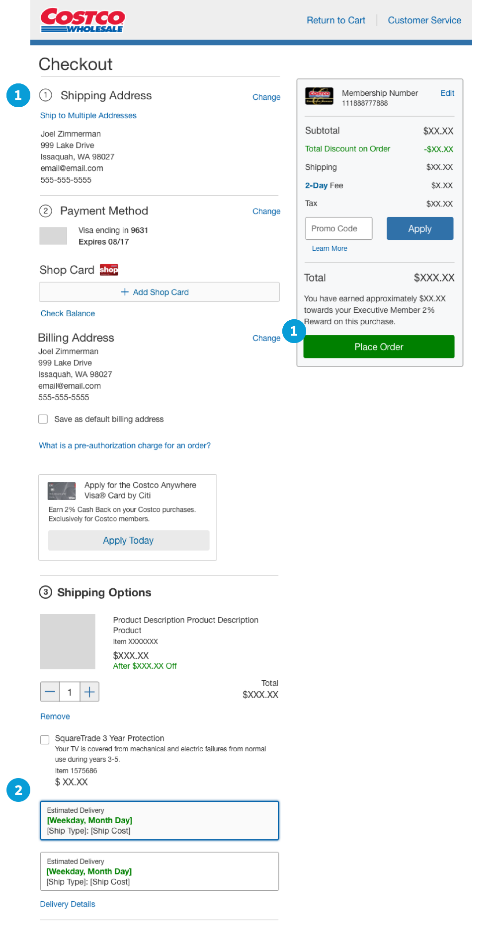
1. Single Step Checkout – Default View for 80% of Members
As mentioned, the new checkout considered the majority of our use cases where ~80% of members had saved address and payment information, and so as soon as they entered checkout they were in a position where they were one button press away from completing their order.
As we saw with Merkle’s heat map analysis, we knew users were spending the most time at the top of the page, and reviewing the Order Summary and selecting the “Place Order” button, and so creating a single page checkout with default information already displayed streamlined the journey for the majority of our audience.
2. Shipping/Delivery Options Always Displayed
In the old checkout, users would be required to select an “Edit” link to open up shipping/delivery options. The improvements to this version of checkout was to present these components as always editable, saving users a click or tap into this information, and making the same information in cart and their interactions always present until a user completes their order.
Order Confirmation Solutions
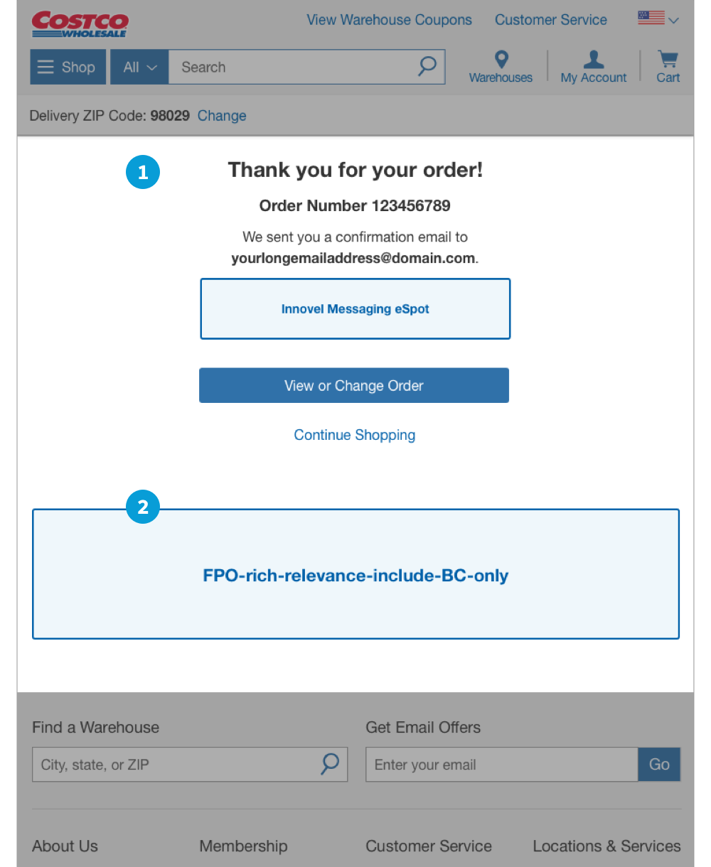
1. Simplified Content & Messaging (MVP)
The original order confirmation page was overwhelming with order information and wasn’t very clear what the next steps were or if there was key information that was important to communicate to users based on their order. In order to streamline the experience, I opted for an MVP of the page with prominent designed order number, the confirmation email address a receipt was sent to, and any specific details related to items in their order.
This worked really well after launch, and the only request that came from stakeholders was to add additional language about waiting a few minutes for the order to show up in a user’s order history. Though, I would have wanted to monitor this page along with customer feedback to determine if there was additional information that users were looking for after placing an order.
2. Added Business Managed Content
To help carry the conversation post-checkout to users, and to provide an opportunity for the business to add additional content that customers may be interested in after checkout, I created a section the business could control depending on their needs and what users may be requesting to see at this point in their post-checkout journey.
Abandoned Features
Checkout Multi-Step Progress Indicator
While we initially introduced a progress bar concept during checkout, we adapted it to suit our single-page design by incorporating step numbers and labels directly into the relevant sections, ensuring clear guidance throughout the checkout process.
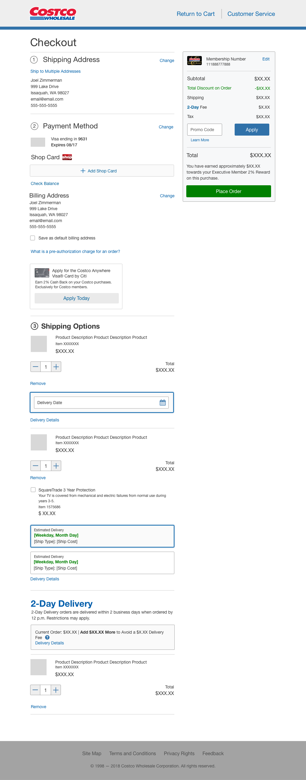
In hindsight, I would have liked to have revisited this and implemented a progress indicator, along with better visual cues within each section (Address, Payment, Shipping Options) based on what is needed by the user and what has been completed to help users focus on the right content at the right time.
Mini-Cart While Shopping
Considered implementing a mini-cart feature during the shopping experience, drawing on a concept previously developed by my teammate and me. However, based on stakeholder feedback, it was deemed too technical and not an immediate necessity, resulting in its exclusion from the project scope.
Grocery Cart Thresholds to Avoid Fees
Proposal involved enhancing data visualization for grocery thresholds, aiming to visually highlight the thresholds and avoid fees or complications during checkout. However, due to its potential impact on grocery operations and considering it wasn’t a strict requirement for the cart and checkout redesign, this aspect was descoped at the time.
Project Impact & Lessons Learned
Business & User Impact
Increased Conversions YOY by 7%
The project contributed to a significant 7% increase in conversions after its launch, showcasing the positive impact of the implemented changes
Seamless Experience for Customers
The introduction of “express” checkout as the default method for members with saved account information was met with enthusiasm from the business stakeholders. They were thrilled with the implementation, especially as they witnessed the subsequent increase in conversions.
Reduced Customer Support Call Volume
Following the launch, there were minimal issues and bugs reported regarding the checkout process, resulting in a minimal number of customer service calls related to checkout problems. This is a huge credit to the development team we worked with from Serbia.
Checkout Has Remained Relatively Unchanged Since Launch
As of holidays 2022, the checkout experience has remained relatively unchanged since its implementation, as it continues to be successful, however I’m excited to see how the team improves the next version in the future.
My Lessons & Growth
Desire To Have Explored More (Design & Research)
I’ve always had a sense after each project of asking “could I (or we) have done more or something better?” Especially when there’s a bit of time between design sign off and the implementation of a project, as creatives, that time allows us to continue to process problems and analyze how we might approach solutions if we only had a little more time for research and design exploration.
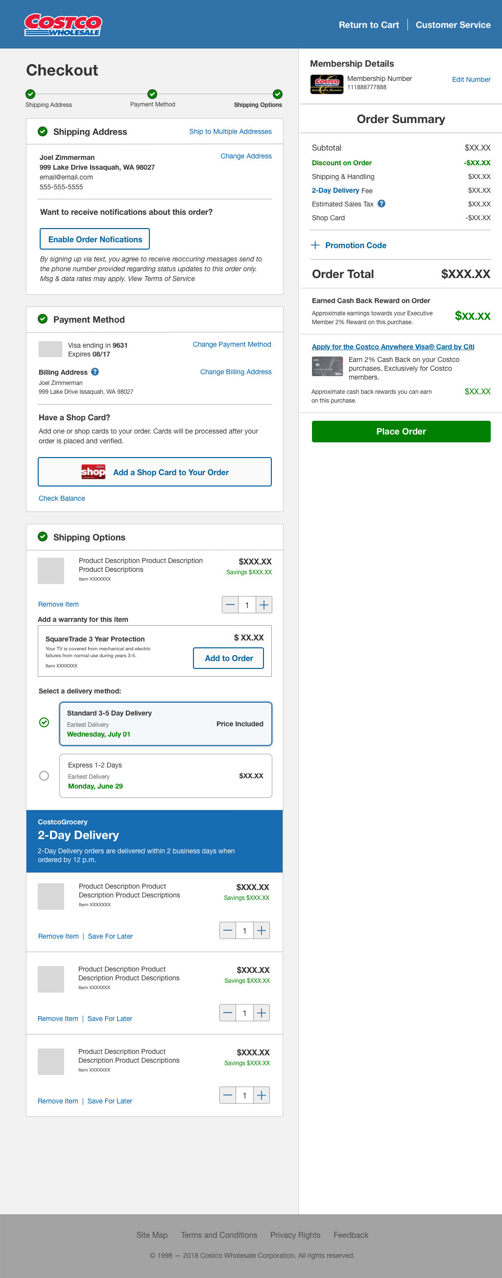
Later in the project I had started working on concepts building upon what had been approved and being built. I’m included some examples of how I would approach refinement, creating a better sense of information hierarchy, using negative space to highlight content, improving upon components based on accessibility, user and business feedback, and understanding recommendations from analaysis on a deeper level.
Additionally, I would have wanted to set up ongoing usability testing to get a better understanding of why users may behave a certain way in order to bring more meaning behind data analytics and recommendations.
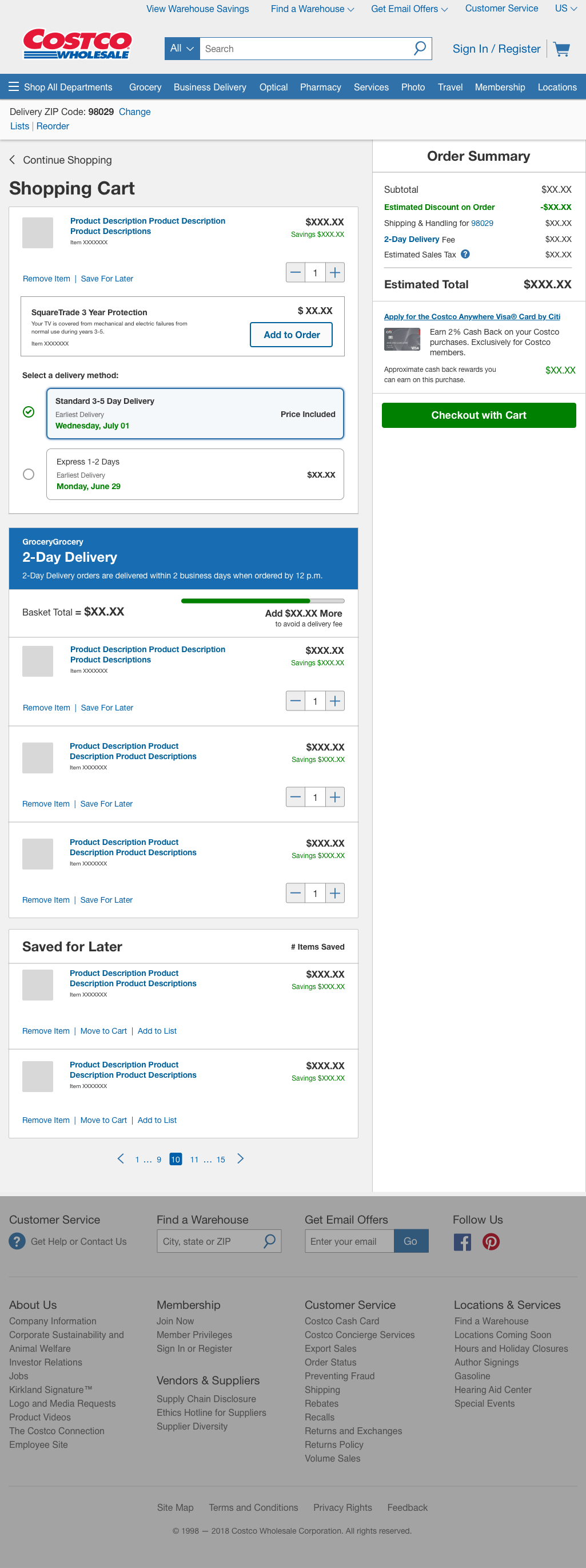
General Cart Design Enhancements
- Improved visibility of content by utilizing contrasting foreground and background and utilizing font styles to give weight to headings and key pieces of information that has been important to both business and users.
- Restructured item level content and interactions to create clearer scan lines for users and group relative information or actions together.
- Warranty up-sell designed to have greater prominence and easier ability to add to order.
- Shipping options visual styles improved incorporating radio buttons along with visual feedback using iconography, color, and weight on selected options. Added pricing information along right side to align with other item pricing.
- Idea to rebrand the CostcoGrocery 2-Day Delivery basket and to add visual identifiers related to basket thresholds to avoid delivery fees related to the program.
General Checkout Design Enhancements
- Improved visibility of content by continuing the contrast between foreground and background with the addition of font styles and weights.
- Progress steps added towards top of page to provide a high-level overview of where the user is at and what steps are next, and includes iconography and other visual treatments.
- Visual feedback using iconography and colors on active and completed steps per each section.
- Additional instructions at varying points to provide context in a step and how users information will be used.

My Lessons & Growth Continued…
Adaptability & Resiliency
This particular project presented a unique challenge as it lacked well-defined requirements and an established project team. Despite these obstacles, I had to deliver designs as if there were an official team in place. This experience taught me the importance of proper project planning and the risks associated with missing requirements and opportunities without the right resources in place. In the absence of a dedicated team, I had to take on multiple roles outside of UX until a proper team was formed, which took several months.
I also learned the importance of adaptability and resourcefulness in progressing the project from the UX perspective when the usual project team resources were not available. This involved seeking out individuals who had relevant information or requesting clarification from business stakeholders to gather the necessary insights.
Importance of Front-End UX Documentation
Documentation played a crucial role in the project, especially when it came to capturing and communicating important decisions that had an impact on the overall project, particularly in the realm of UX. By documenting these decisions during a project that was a bit messy, I could effectively communicate updates to my manager, provide a reference for other designers or new team members, and ensure that the responsibilities of UX were clearly outlined.
Another key lesson I learned was the value of creating comprehensive documentation for user flows, interaction content audits, and various “checkouts” across the website, including those involving third-party vendors. This documentation helped define the information architecture and enabled other designers to understand the system based solely on the documentation provided. It was the most extensive front-end documentation on cart and checkout that the company had at that time.


