Software & Intranet
Employee Portal
An enterprise concept aimed to establish a centralized platform for employees to access essential tools and information required for their role, through a single sign-on approach.

The Objective
Initial Gaps when UX Joined Project
This was one of the most interesting projects I was on during my time at Costco, and demonstrates the ability UX can have in guiding the project vision and roadmap through a wide range of research methods. When I joined the project early on, a request from our enterprise architect to include UX services, it faced several challenges.
- Technology (Backbase) had been purchased prior to understanding both business and user problem space and goals
- High-level strategy outlined a few general purpose features and integration within Google App Suite
- Limited information documenting business objectives, opportunities, and other high-level requirements
- Previous attempts to advance the project had been unsuccessful
Project Objectives UX Uncovered through Stakeholder Interviews
As my co-designer and I struggled to gain perspective to under the project goals and how we could help, I proposed conducting stakeholder and project team interviews to gather insights and uncover commonalities that would set a project vision. Based on those early interviews we were able to identify and align stakeholders with a core set of business objectives.
- Implementing a Single Sign-on (SSO) solution for employees and vendors to streamline the authentication process into Costco systems
- Creating a central location for employees and vendors to access applications, promoting efficiency and convenience
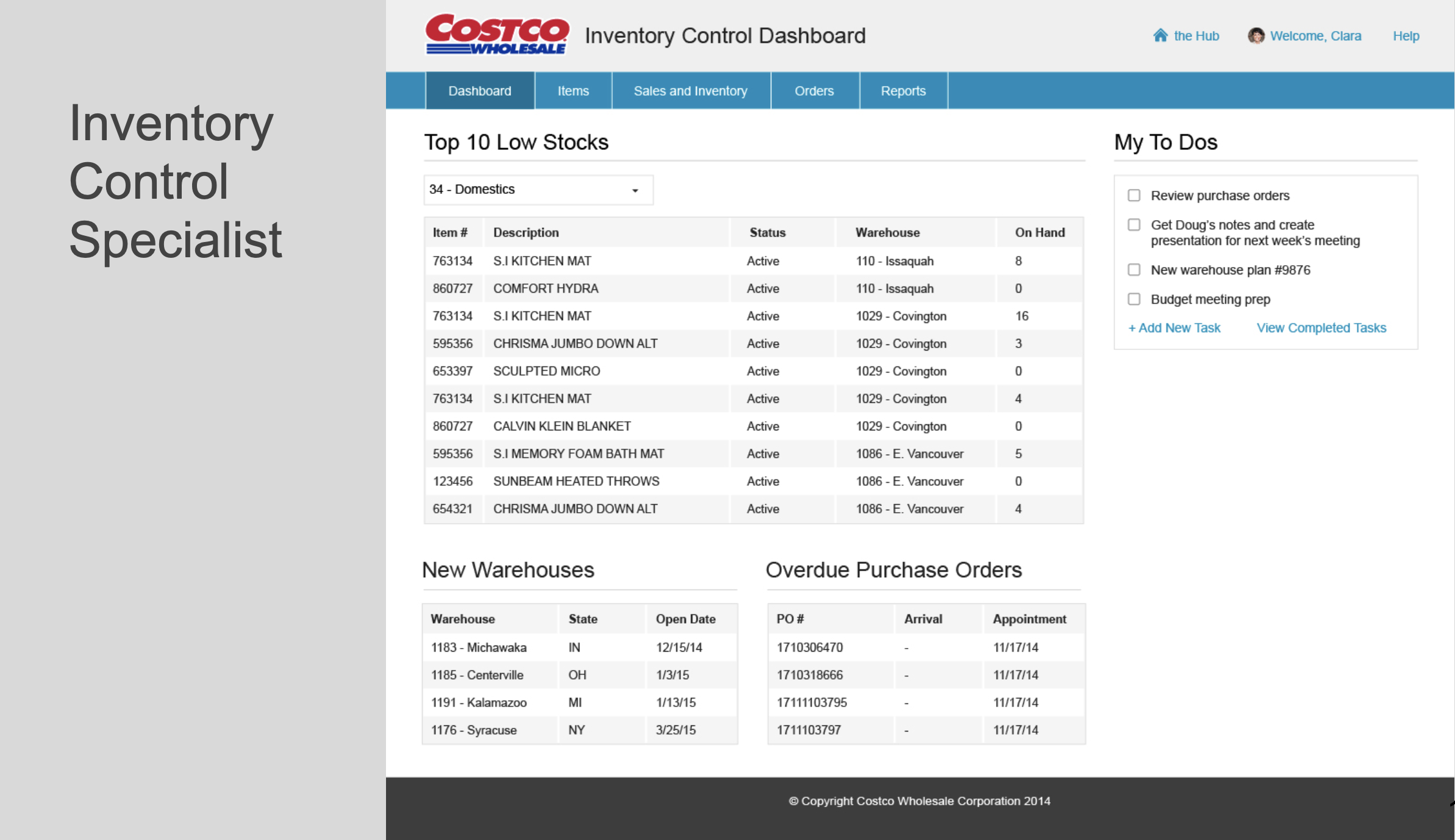
- Providing snapshots of data from select applications, allowing users to quickly access and view relevant information to their day-to-day activities
- Enabling multi-channel access for employees and vendors, ensuring they can interact with the system through different devices
- Implementing role-based content and information, delivering personalized experiences and ensuring users only see relevant data based on their specific role and responsibilities.
My Role
Lead UX Research & Strategy
My primary role was leading research strategy, conducting, analyzing, and presenting research into a larger project vision and direction, supported by my co-designer. We would later shift responsibilities as she took the lead when we transitioned from research into design proof of concepts.
Co-Lead Overall Project
My co-designer and I were the two UX designers assigned to the project and we led the project together specializing in our own core responsibilities and supported each other as we managed the project and UX strategy.
Primary Project Team
- Enterprise Architect
- Project Manager (2)
- Business Relationship Manager
- Business Analysts (several)
- Technology Lead (contractor)
- Developer Lead (Contractor)
- UX Designers (2)
Stakeholders
- I.T. VPs
- I.T. Directors
- UX Manager
The Challenges
It’s no surprise when working on any project, specifically in an ambitious and complex effort, challenges will always exist. It’s how you come through those challenges that’s important. Some of the main challenges on this project regarding UX included:
- Securing buy-in from various levels of leadership
- Developing the business strategy and roadmap through extensive research and planning
- Managing work with limited project resources, including only two UX designers who were new to the company
- Managing a large-scale design and development effort, including a need for a team of Java developers and collaboration with multiple teams and business areas
- Creating a brand and visual design from scratch
Key UX approaches that contributed to our success
- Collaboration with stakeholders and our direct project team to define the vision and roadmap
- Research that gave us the insights around employees behaviors and needs
- Identifying and defining key user roles to design and develop towards
- Recognizing the importance of multi-device access and responsive designs
- Creating a list of opportunities, known and possible risks, and assumptions based on our research
- Understanding best practices of portals and intranets and core capabilities for success
Key design direction that helped solved user problems
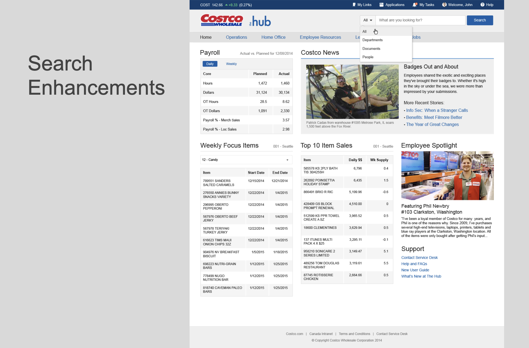
- Creating role-based and dynamic views upon user sign-in
- Enhancing at-a-glance content to focus on highly-used and current tasks
- Improving content findability through enhanced search capabilities
- Organizing navigation based on user roles and business areas, bringing together teams whose sites were previously separate from the intranet
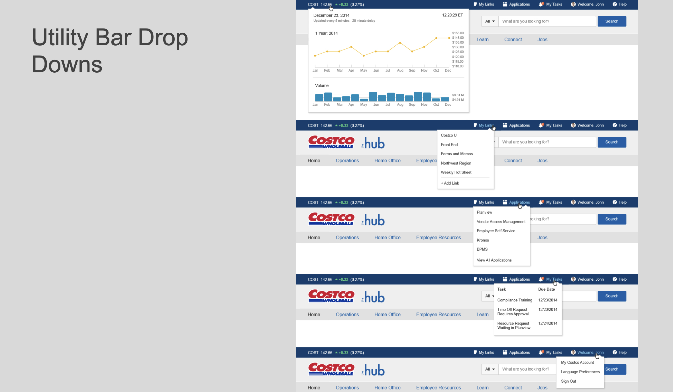
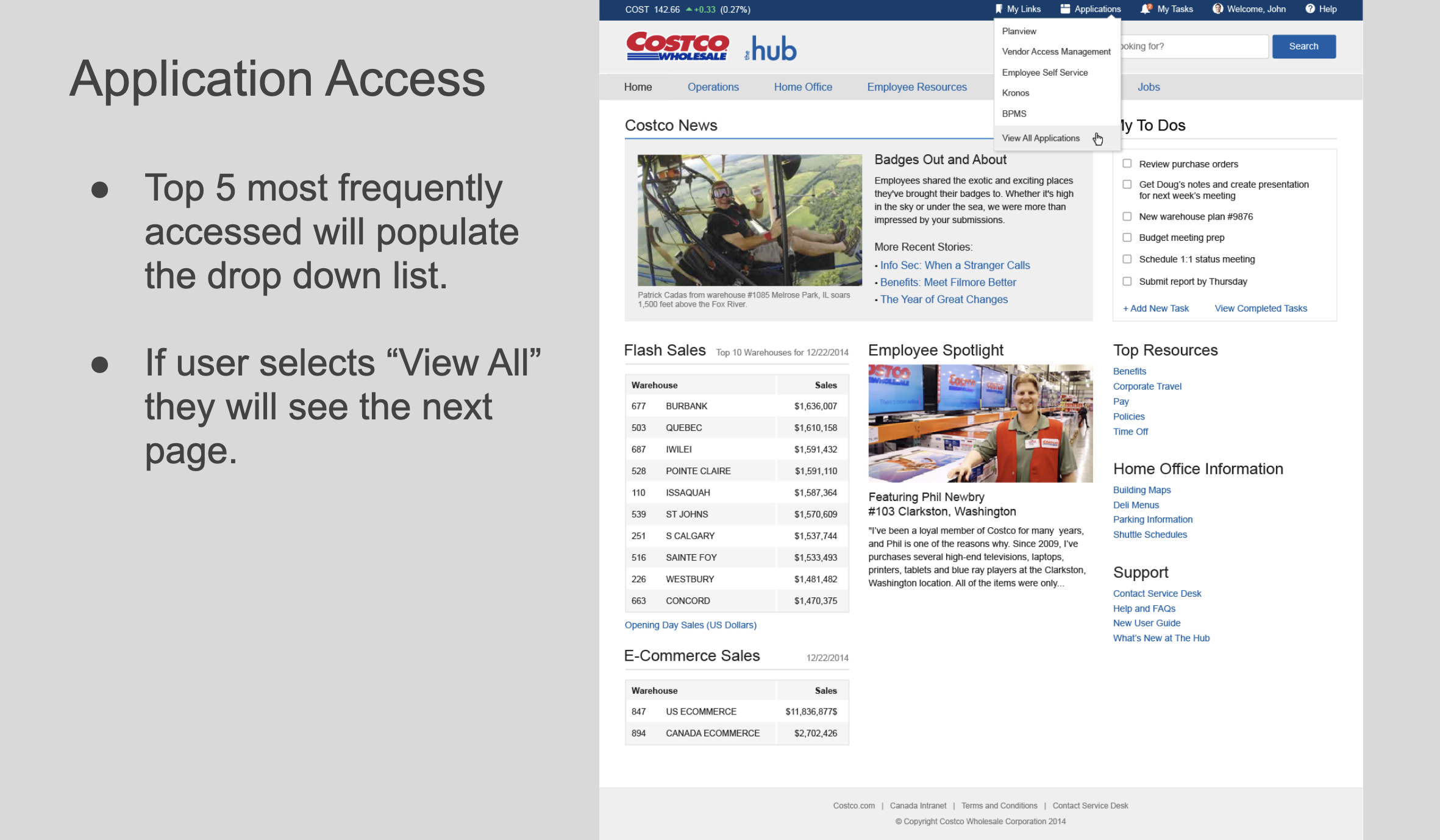
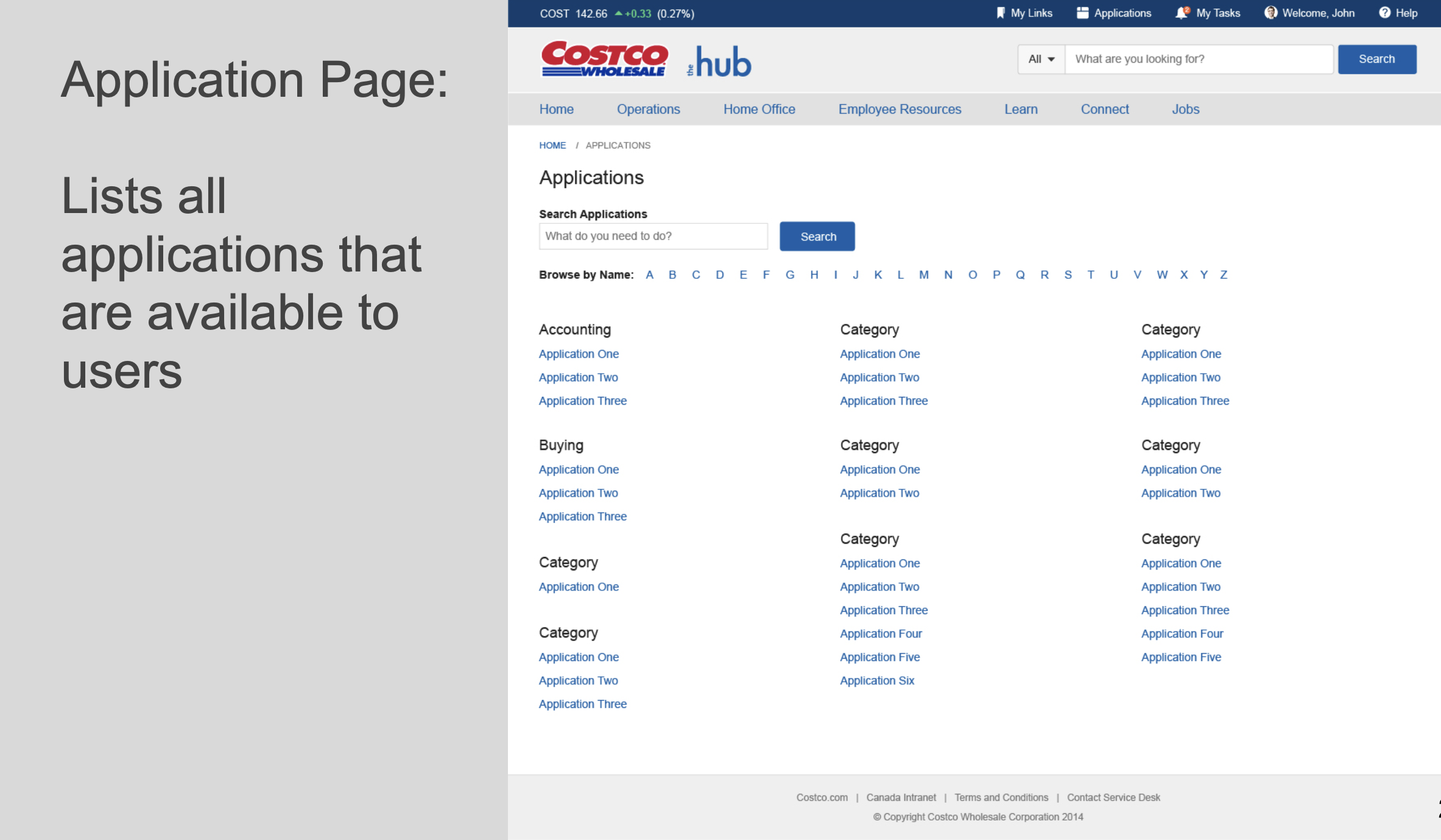
- Facilitating application access by highlighting the most commonly used apps while providing access to all available apps
- Incorporating stories that showcase Costco culture, operations, and employees, as well as highlighting warehouse news and updates
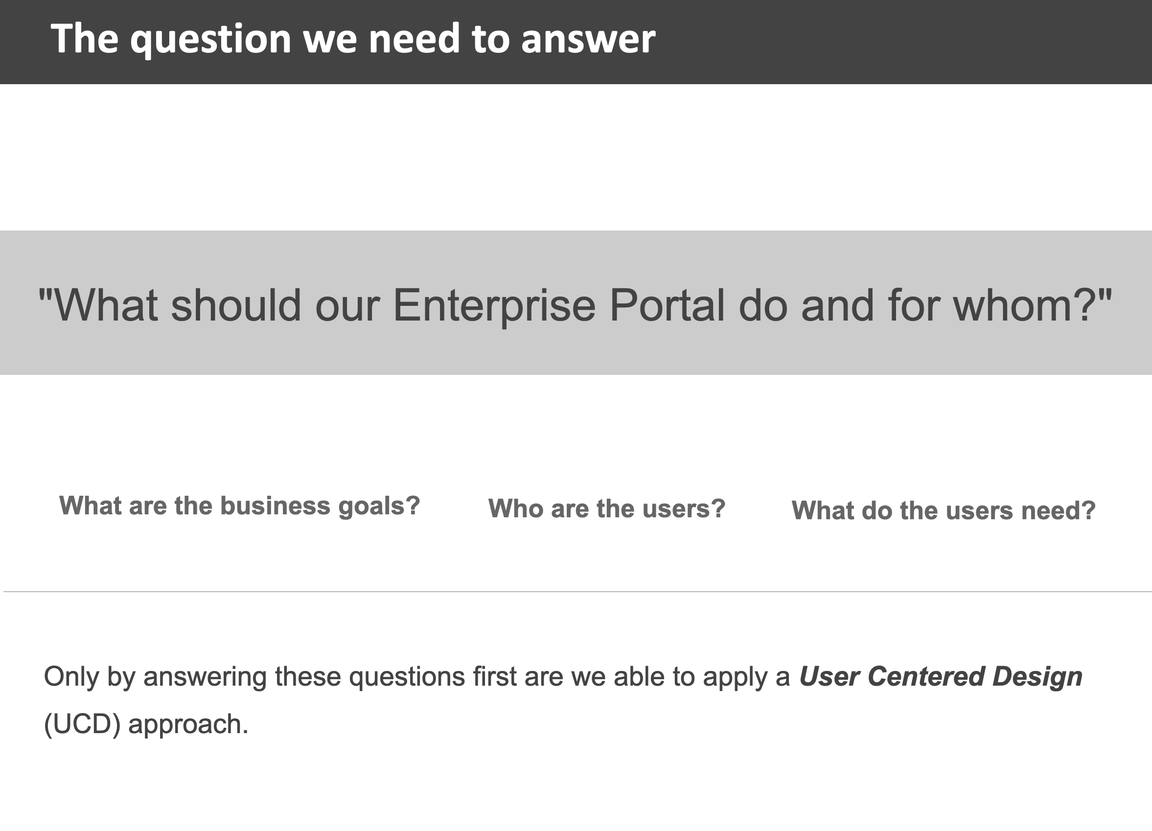
What should our employee portal do and for whom?
The Approach
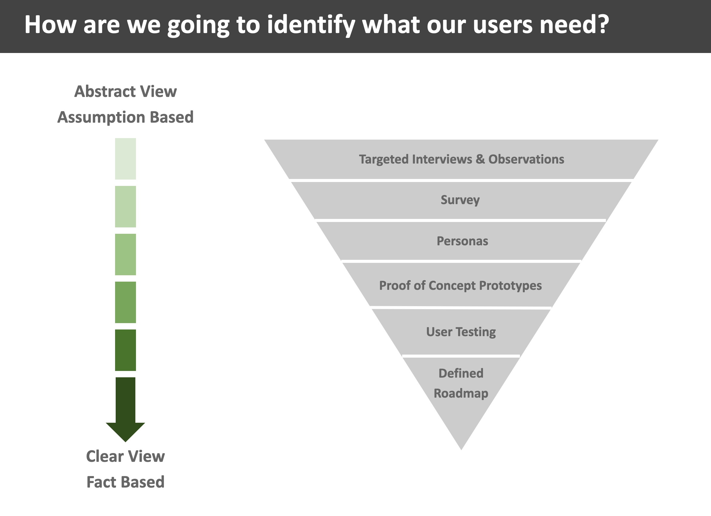
Once we had business objectives defined, we were able to turn our attention to the research we needed to do do uncover what exactly we needed to build and who we needed to build it for.
Research
- User Interviews engaging with employees across corporate, regional, and warehouse to gather qualitative insights to understand their needs, behaviors, and expectations around their day-to-day activities
- Survey for intranet use across entire company to collect quantitative data and gain a broader perspective on employee behaviors, current problems, needs, and demographics with the current intranet at that time
- Personas that captured and represented key roles, themes, and needs for corporate, regional, and warehouse employees
- Best practices and research assessing similar platforms and systems to identify core themes regarding successfully implemented products, and identifying areas of opportunities within our own product
- UX evaluation of the intranet to get a deeper understanding of issues and opportunities for improvement
- Content audit to capture every page, the business owner and persons responsible for publishing, and page details such as URL, routing, and general notes
- Data analysis of the intranet to determine high-accessed information and where people were generally navigating to
- Affinity mapping with the UX team to determine features and content, groupings for the home page of the portal
Design
- Proof of Concepts from sketching ideas, developing hi-fidelity concepts, and working with our tech leads to quickly prototype concepts in a test environment
- Branding definition including working on a name and logo, incorporating employee feedback to help develop a sense of ownership of the product
- Visual design to create a cohesive and pleasant look and feel that aligns with product goals and is represented by and fits within company culture
Research & Insights
Our research focused specifically on understanding the needs and behaviors of employees across the organization. We planned and conducted employee interviews while simultaneously coordinating activities such as employee surveys, personas, content audits, and data analysis. This comprehensive approach allowed us to gain a deeper understanding of what constitutes a successful, useful, usable, and engaging intranet within organizations.
We presented these findings and recommendations to various stakeholder groups, fostering consensus, aligning with our technical partners, and establishing a detailed strategy and roadmap for the project.
User Interviews
We interviewed 23 employees across various roles focusing specifically on their day-to-day behaviors and needs. We understood various applications being used, highly-accessed information and data, and what each person cares about and needs while at work.
User Survey
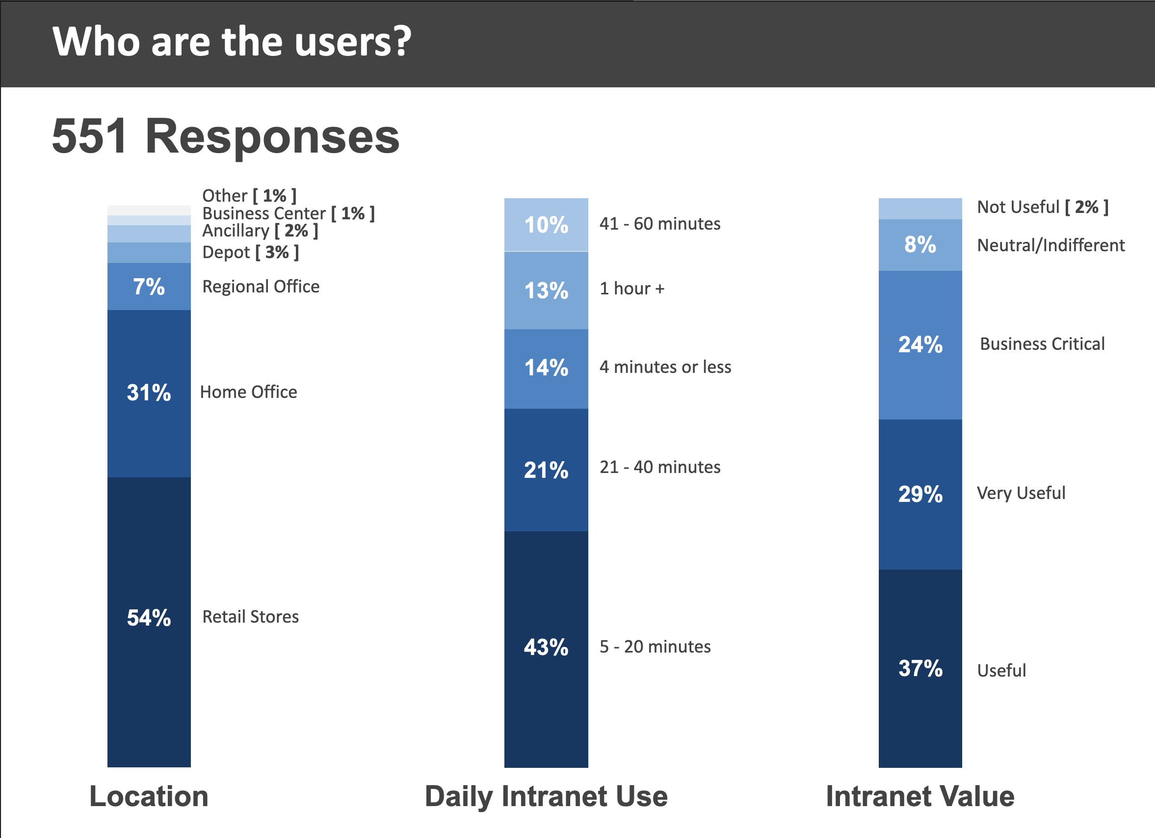
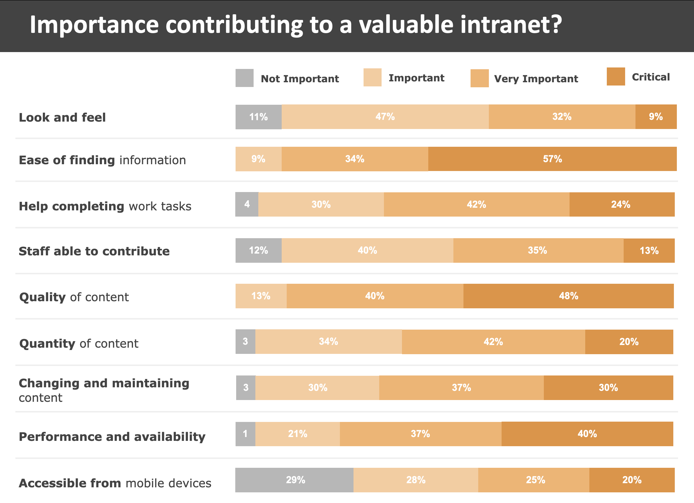
To understand a better sense of how the current intranet was being used we sent out a survey to all employees. We received 551 responses through various roles across the company gaining quantitative insights into the importance of the intranet, how it was being used, and where problems and opportunities existed.
Personas
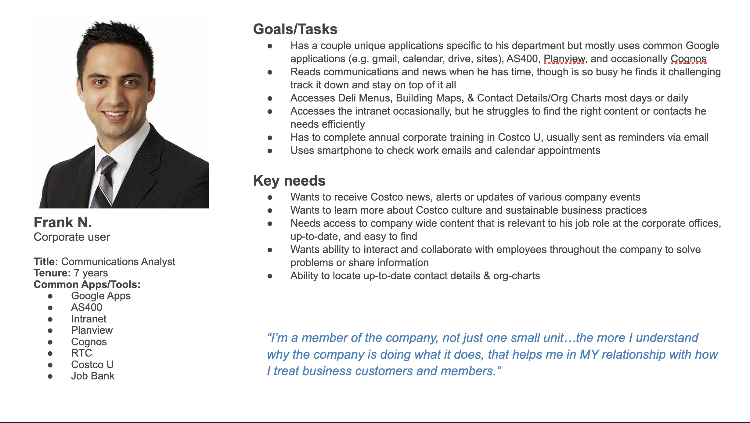
Based on the user interviews and survey, we were able to define several personas that captured the roles of Corporate, Regional, and Warehouse employees, each with their own set of responsibilities, common applications, goals, and needs.
Key Research Insights:
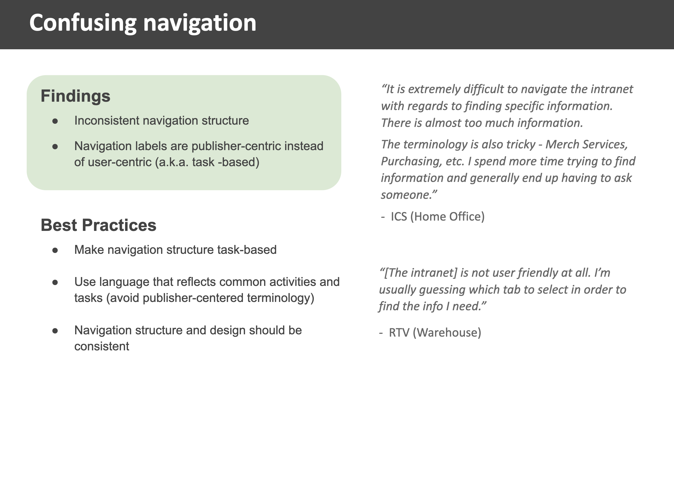
- Confusing Navigation – Structure inconsistent and labels tended to be publisher-centric vs. user-centric
- Inconsistent page structures with outdated information and documents, and highly-used content scattered or buried
- Search was not relevant or effective and highlighted incorrect or outdated information
- Teams had and were continuing to move their site from the intranet to detached google sites, creating disparity of information, decreasing discoverability and awareness
- Lack of easy access to org charts, contacts and contact information, including outdated information as this was highly used, especially by the warehouses when problems arose with members
Common Suggestions from Employees:
- Include more stories about the culture and how the company operates
- Source collection of external news updates
- Share more information about new warehouses and openings
- Provide a social or collaborative space to interact with other employees
- Centralize similar content so it’s in one location
- Provide content owners with easier and more timely publishing methods
- Allow users to access intranet remotely or on mobile devices (a finding we found especially true for warehouse employees as they were typically not in front of a computer)
“I’m a member of the company, not just one small unit…the more I understand why the company is doing what it does, that helps me in my relationship with how I treat business customers and members.”
Product Vision & Roadmap
Product Vision
After we wrapped up our research, and in parallel with our design work, my teammate and I were tasked in creating the product vision, pulling from our themes and insights from research and stakeholder interviews. This vision would frame the purpose of the employee portal that could bring a shared understanding, focus and guidance behind the application.
This took quite a bit of experimentation with phrasing as we wanted the vision to be concise and clear, while encompassing as much purpose we could include for such a dynamic application. Through a lot of feedback from other UX designers, stakeholders, and leadership, and a strong craft with words from my co-designer….the following vision was created:
“The Hub is an enterprise-level portal that serves as a central location where employees and vendors can access the tools, applications and information they need to do their jobs. It provides a personalized, role-based experience that is easy to use, simplifies business processes and creates a positive and seamless brand experience.”

Product Roadmap
As we progressed through the design phase and analyzed our research findings, our team recognized the importance of establishing a clear direction for our project. We understood that a well-defined roadmap would be instrumental in guiding our efforts effectively. To develop this roadmap, we engaged in collaborative discussions with both our technical team and direct stakeholders.
Our approach involved synthesizing various parts of our work so far, including technical requirements, persona user groups and their needs, and the primary project objectives. We aimed to strike a balance between immediate needs and long-term goals, ensuring that our roadmap encompassed both quick wins and more substantial undertakings.

Key considerations in our roadmap development included:
Prioritization of Features: We carefully evaluated the features identified during the design phase, prioritizing those that aligned most closely with our project objectives and user needs. This involved weighing factors such as user impact, technical complexity, and resource availability.
Sequence of Implementation: Understanding that not all features could be implemented simultaneously, we sequenced our roadmap to maximize efficiency and minimize dependencies. By identifying logical progressions and interdependencies between tasks, we aimed to streamline our development process and minimize bottlenecks.
Focus on Key Functionality: Recognizing that certain features were essential to achieving our project’s primary objectives, we emphasized the importance of prioritizing these key functionalities in our roadmap. This ensured that our efforts remained aligned with the overarching goals of the project and delivered tangible value to our stakeholders.
Flexibility and Adaptability: While our roadmap provided a structured plan for our project, we also recognized the need for flexibility. Market dynamics, user feedback, and technological advancements could necessitate adjustments to our plans. As such, our roadmap was designed to accommodate changes and iterations, allowing us to respond effectively to evolving circumstances.
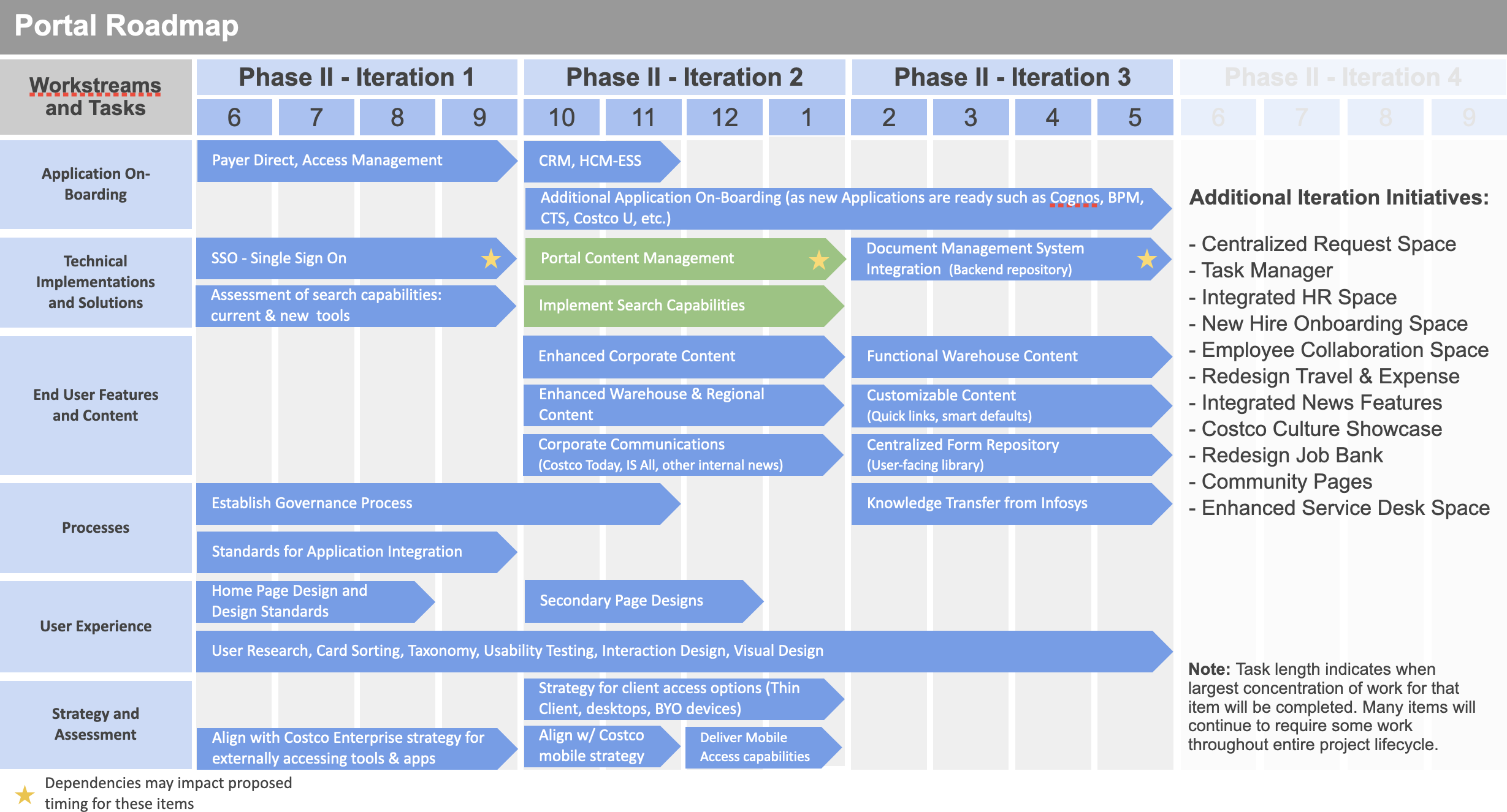
By following an iterative process and leveraging the collective expertise of our team and stakeholders, we were able to develop a comprehensive roadmap that served as a guiding framework for our project. This roadmap not only provided clarity and direction but also facilitated effective communication and alignment across all stakeholders involved in the project.
Design Process
As we moved to the initial stages of portal concepts, we created early sketches and low-fidelity concepts based on research and input we compiled. Given Costco’s conservative nature, it was crucial to consider this aspect when approaching visual design and functionality.
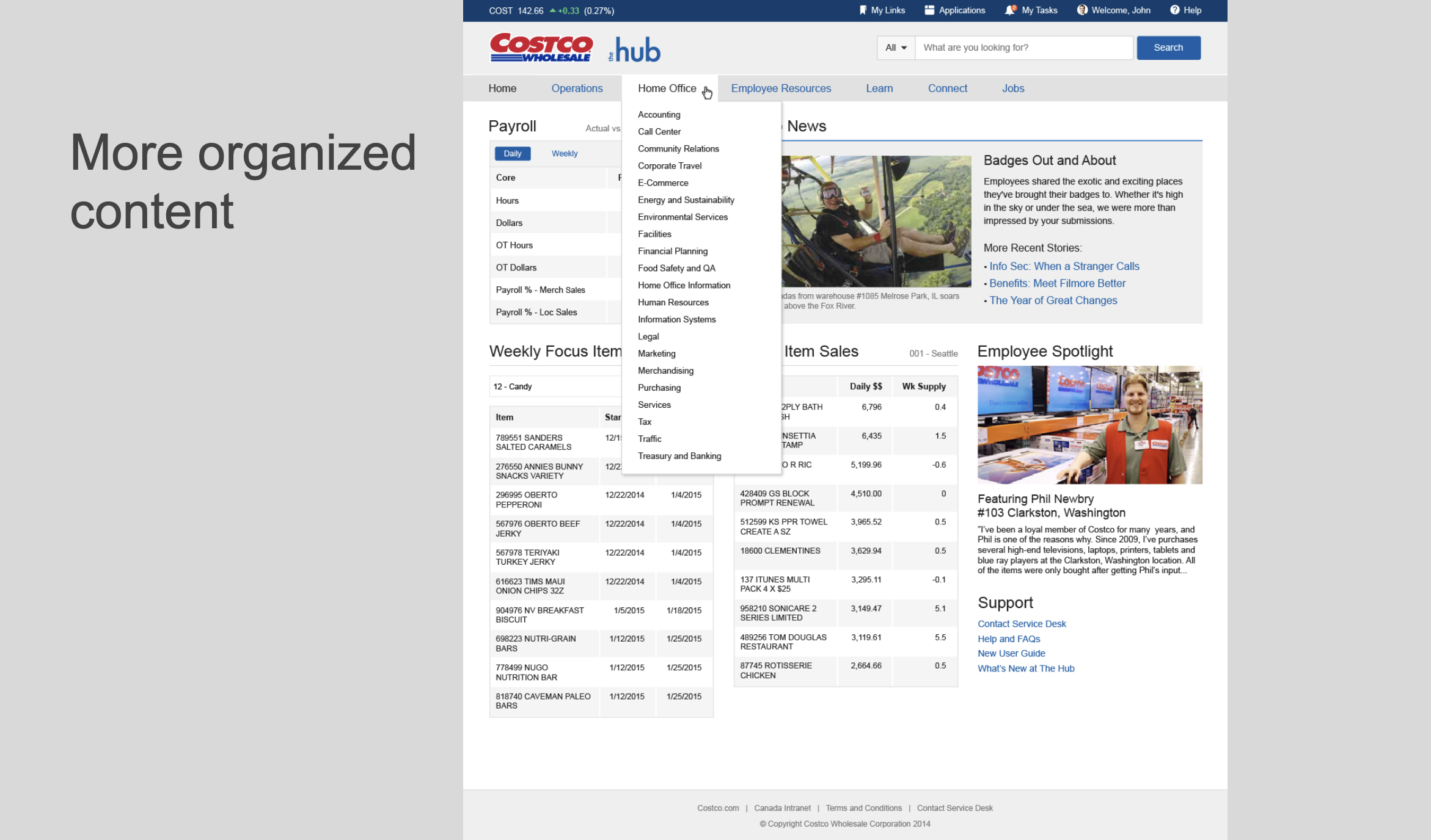
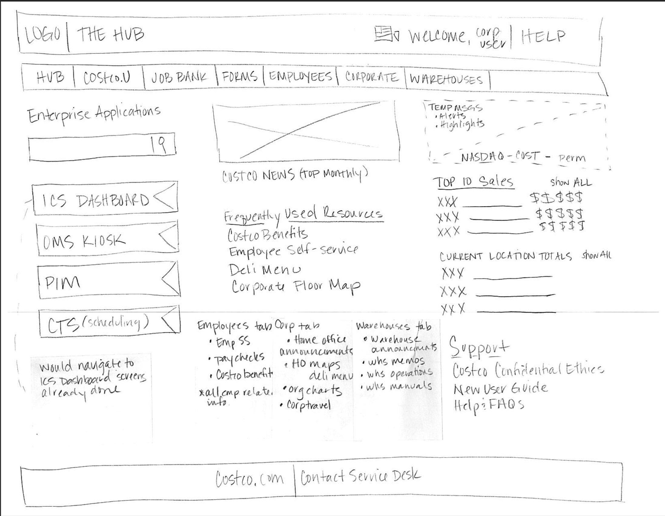
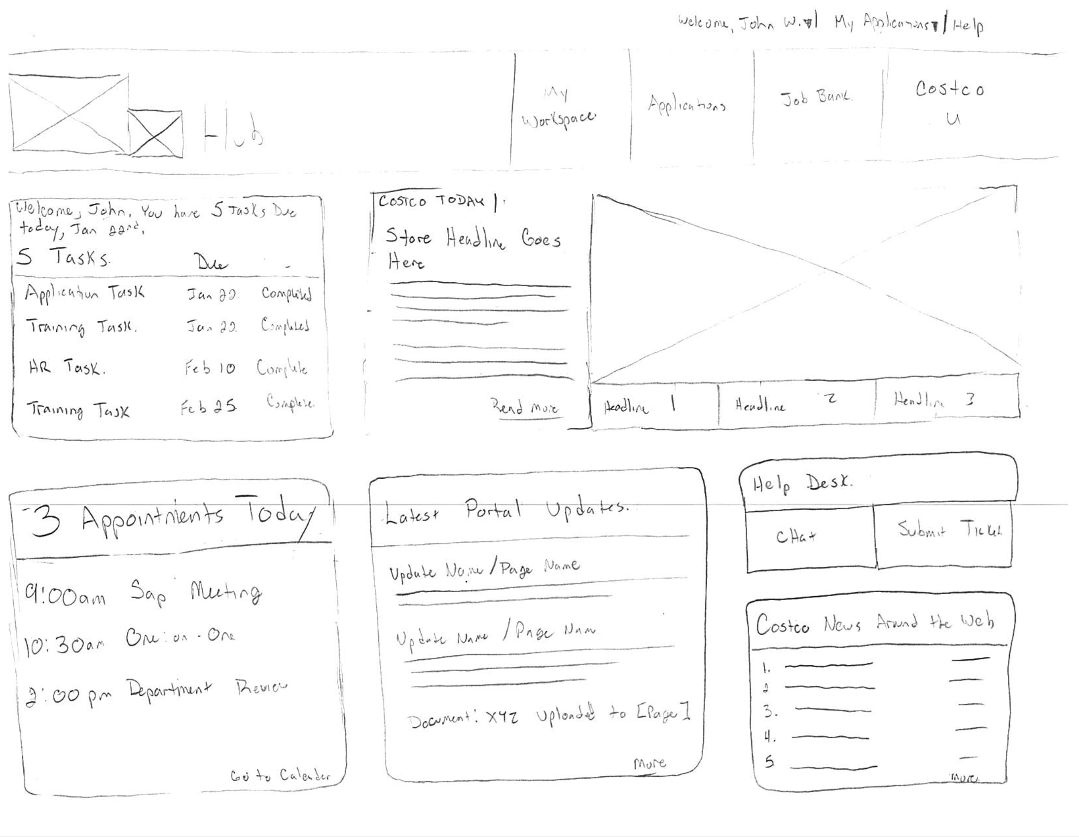
Our goal was to prioritize the most frequently used elements for different user groups, ensuring that the content was actionable, summarized their daily responsibilities, and presented information and content in a dynamic manner. On the landing page, we focused on prominently featuring apps, commonly accessed documents, tasks, calendar, and training materials – all key components of the content we aimed to highlight.
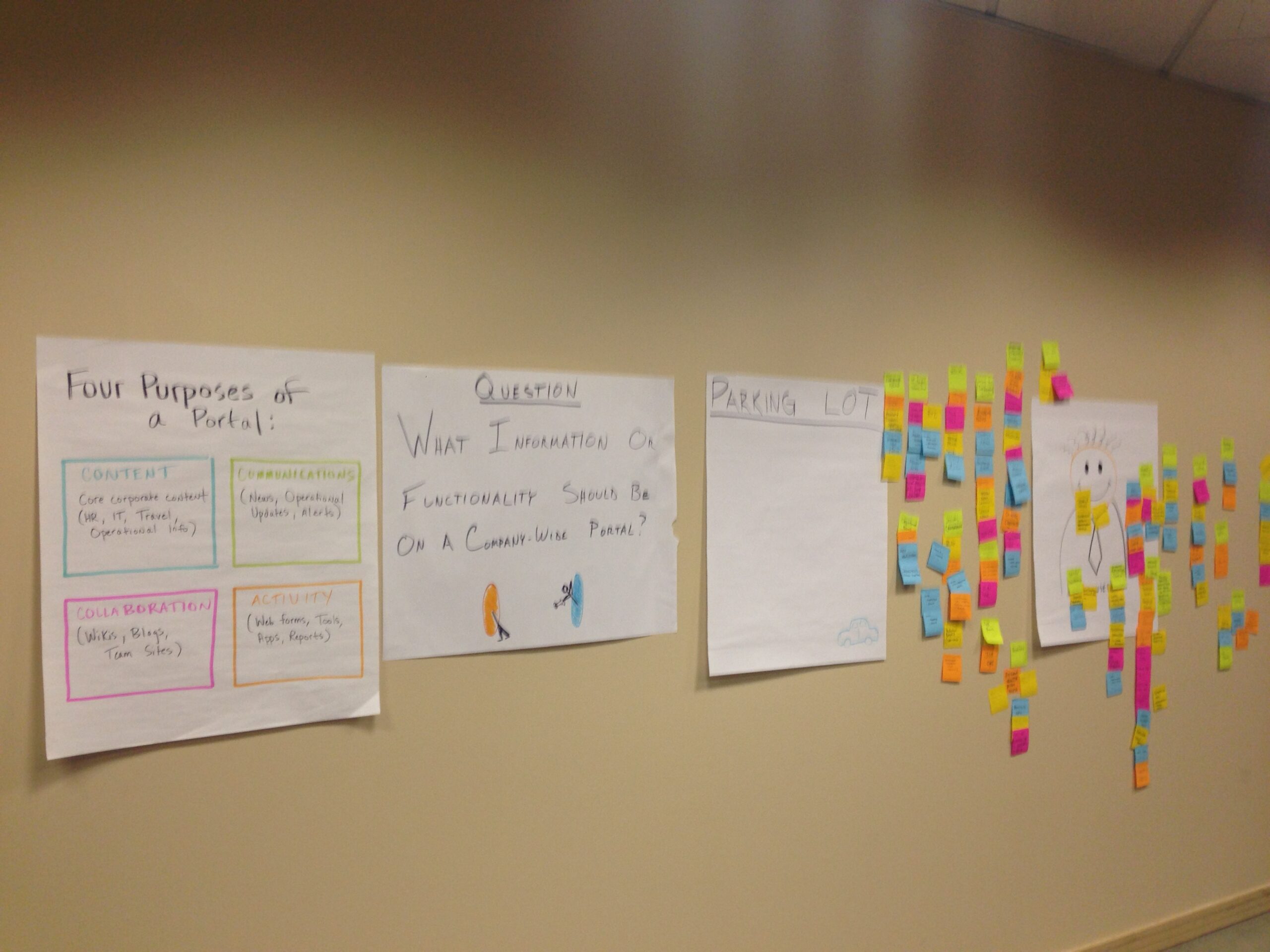
UX Team Affinity Mapping
To help myself and my co-designer explore the problem space, we co-led an affinity mapping session with our large UX team to identify their perspective of what would be important, grouping of that perspective, and then moving into sketching exercises to explore the space through design.
We both shared presenting responsibilities, first walking through our research and key insights prior to our affinity mapping exercise, including high-level best practices that help make intranets and portals successful within organizations.
We spent some time discussing perspectives from the team on the patterns and groupings of certain features or information, and then moved into sketching exercises with the team.
Sketches
We did a couple rounds of sketches with the UX team as we experimented with concepts. We focused primarily on the main architecture and landing page an employee would primarily access day-to-day, as our research was captured at this high-level stage.

Proof of Concepts
Concepts were refined through iterations and feedback from the UX team, pulling together all the features, thinking about our employee roles and what they each need, and proposing ideas through hi-fidelity concepts. My co-designer and manager both were responsible in developing and presenting concepts from here, pulling together the vision, what makes portals successful, and the concepts based on roles.
The designs my co-designer presented were well received by stakeholders, indicating a positive direction for the project. It seemed like we were moving towards developing more detailed concepts, conducting targeted research, and preparing for usability testing based on the project roadmap and its impact on various user groups.
One challenge we had at this point in the project is while our initial sketching and lo-fi concepts incorporated more actionable features within the landing page of the portal such as visibility to applications, display of most used content and immediate access to the help desk, or at-a-glance information related to calendars and tasks, our stakeholders had pressured us to eliminate some of that from our concepts and to pull in data related information in order to help sell the concept up to leadership.
This was an interesting time as I felt this took away a bit of what the vision for the portal was, but there are a lot of times we need to rely upon our management and stakeholder feedback as they are they ones who are making the decisions or need to present higher up in a specific manner. And so, the following design concepts are what made it through to final stakeholder reviews.
Business Impact & Lessons Learned
Project Impact on Business
Defined product vision and roadmap through user-centered research and design
Through the research and design methods we used, we were able to not only define a vision for the product and a roadmap the project could deliver upon within a two-year project but also managed to get stakeholders all across I.T. bought into the proposal for the project.
Project postponed with portions of our work being used in other applications
The project was ultimately cancelled due to the cost of the build and maintenance, requiring hiring developers who were experts in Java. This was an ambition project, one that could have had a benefit for employees, but costs are important and resourcing would have been critical to make this a success. However, all was not lost, and a limited version of what was designed was utilized for a vendor access portal, utilizing SSO, and providing a single point of entry for vendors and applications.
I believe it was a wise decision. Although it would have been exciting to be involved in a ground-up development of new product, with significant value, I understand the practicality of opting for a more cost-effective approach, such as utilizing a third-party off-the-shelf product that can be configured to meet user needs. While there is inherent value in building something from scratch, I recognize why in-house projects often face cancellation challenges when expenses are considered.
My Growth & Lessons Learned
Purchasing technology before understanding problems and opportunities with users
Purchasing technology without a deep understanding of user behaviors, needs, and problems often leads to high costs and increased risks, both from a project and end-user perspective, reducing effective outcomes and ROI.
Discovery research is important when defining a product
Early research plays a crucial role when developing new products or services as it helps eliminate assumptions, distills themes and opportunities, and relies on actual user behavior and problems.
Working with a wide range of stakeholders gave invaluable insights
We worked with quite a few stakeholders across varying levels and areas in the company from VPs to individual contributors. The ambitious research approach we chose gave us a valuable opportunity to understand how company operates across different business areas, and an opportunity for people to feel like they had some ownership in shaping the product for employees.
Experience going from research to hi-fidelity concepts; end-to-end UX process
This was one of the largest projects I’ve been on, and while the work followed the UCD process, utilizing research that impacted the direction of the project, and being part of the work my co-designer created from scratch was an incredible experience as a UX designer to go through.
I learned a lot through this experience, especially from the branding a visual design side in creating a product from scratch that needed to consider many different ways people could interact with, while also keeping in mind scaling something that is meaningful and extendable for a diverse set of users groups.
