Web Design
Antsmarching.org Redesign
A redesign proof-of-concept on a long-time running Dave Matthews Band fan community site with usability and modern visual style update
Website:
www.antsmarching.org
UX Methods
- Information Architecture
- Interaction Design
- Visual Design
- Data Visualization
- Branding

The Objective
This project is a personal undertaking driven by my curiosity to delve into design work beyond the work I was working on officially at Costco. Antsmarching.org, an integral platform in the Dave Matthews Band community for over two decades, hosts diverse content, including a blog, tour information and metrics, an online store for merchandise, and a message board.
The website had seen only occasional updates since its inception, motivating me to create a modernized version that encapsulated the site’s spirit while addressing potential usability issues. The primary objectives I pursued in this project included:
- Page Architecture Refinement: Restructuring the layout of data-heavy pages to highlight essential content and simplify their presentation
- Dark Theme Exploration: Contrasting the site’s original light theme since its launch with an exploration of a dark theme to provide users with an alternative visual experience
- Responsive Design: Implementing a responsive web approach to ensure the site adapts effectively to various screen sizes and devices
-
Touch Target Optimization: Enhancing the size of touch targets to improve mobile usability and overall user-friendliness
-
Reduced Advertising: Minimizing the prominence of advertisements on the site to create a cleaner and less intrusive browsing environment
-
Promotion of Ants+ Subscriptions: Encouraging users to consider Ants+ subscriptions, providing additional benefits and supporting the site
The results of this personal exercise was gaining interest among one of the site owners regarding a proper redesign as they had liked the design progress and wanted to explore other concepts. Unfortunately, as we tend to be busy with day-to-day work and life, we never made it beyond some initial conversations.
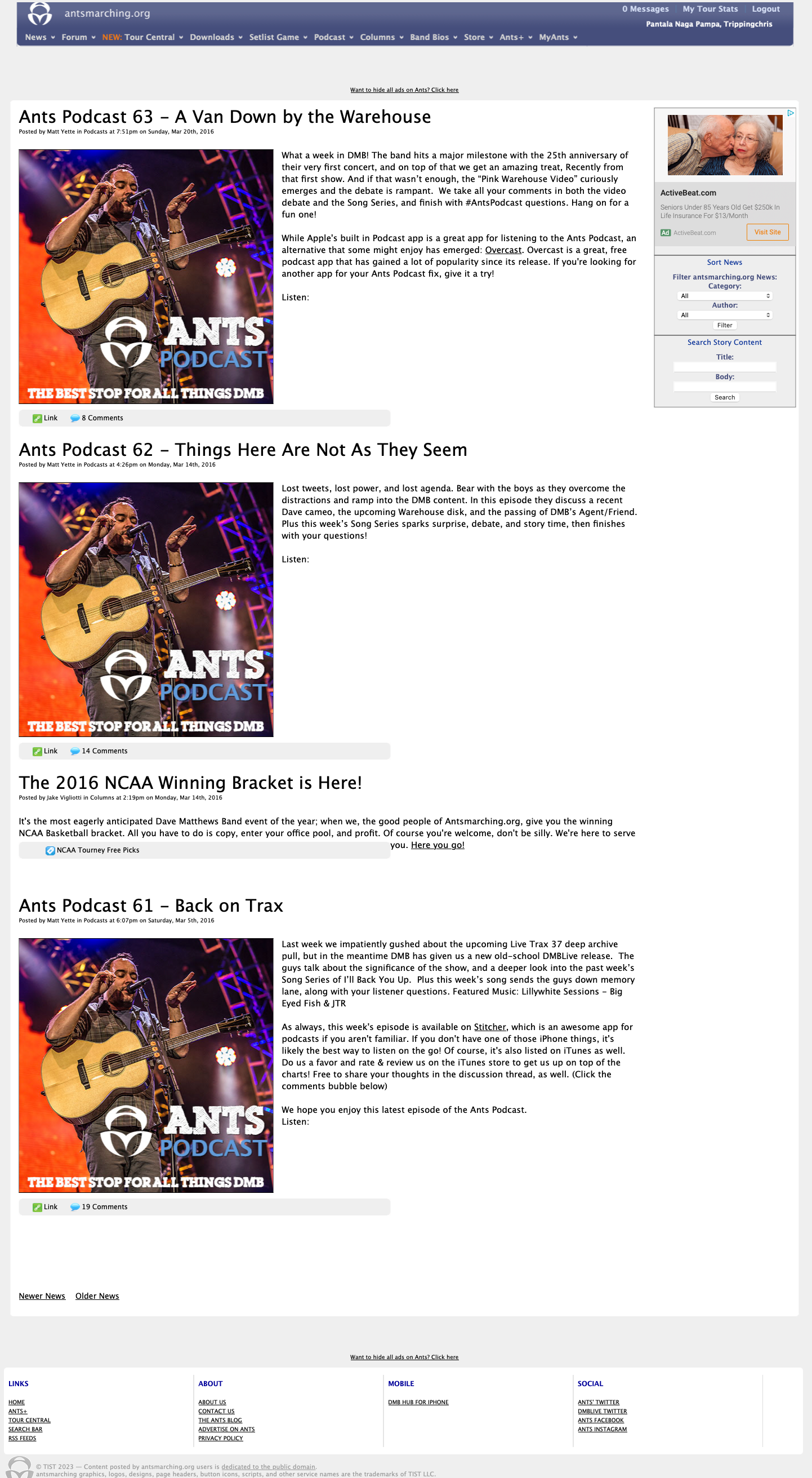
Home Page
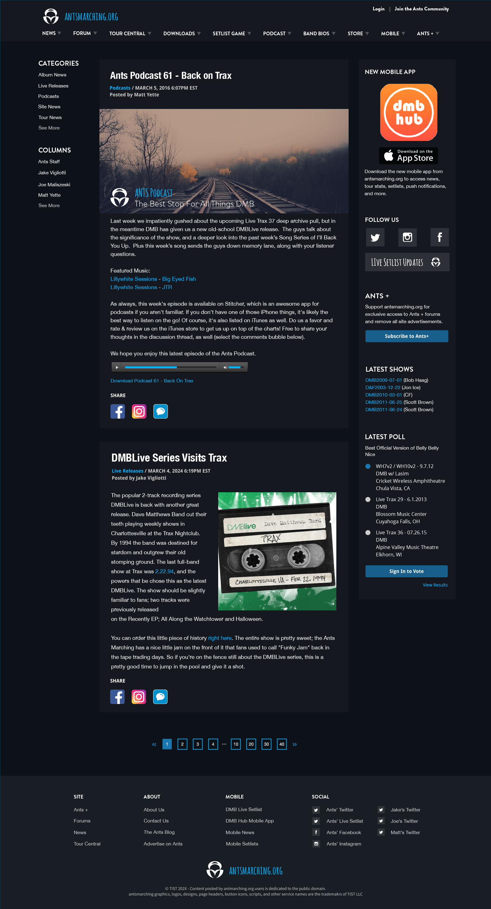
The homepage project involved curating a history of blog posts and presenting high-level information about the website, which encompassed subscriptions, a mobile app, social media links, and various concert and survey data points. To enhance the overall user experience, the project incorporated the following design enhancements:
-
Visual Identity and Character: The first focus was on crafting a visually appealing identity that effectively conveyed the website’s essence. This was achieved through careful font selection, color palette choices, and strategic placement of call-to-action elements, imbuing the design with character and personality
-
Global Header and Footer: The project also introduced a cohesive global header and footer. These elements were designed with the objective of enhancing visual clarity and maintaining a harmonious spacing arrangement between interactive components throughout the website
-
User-Friendly Filtering: In line with improving user experience, user-friendly filtering mechanisms were implemented. This included features such as category sorting and column organization, while ensuring that supplementary information remained readily accessible and relevant to users
-
Optimized Touch Targets: To enhance usability, touch target dimensions were augmented. This adjustment aimed to optimize the user experience, especially on mobile devices, by providing larger and more user-friendly touch areas
-
Seamless Navigation: A pagination system was introduced to facilitate seamless navigation through previous news articles. This feature provided users with improved guidance and a more effortless means of exploring historical posts
Tour Central Summary
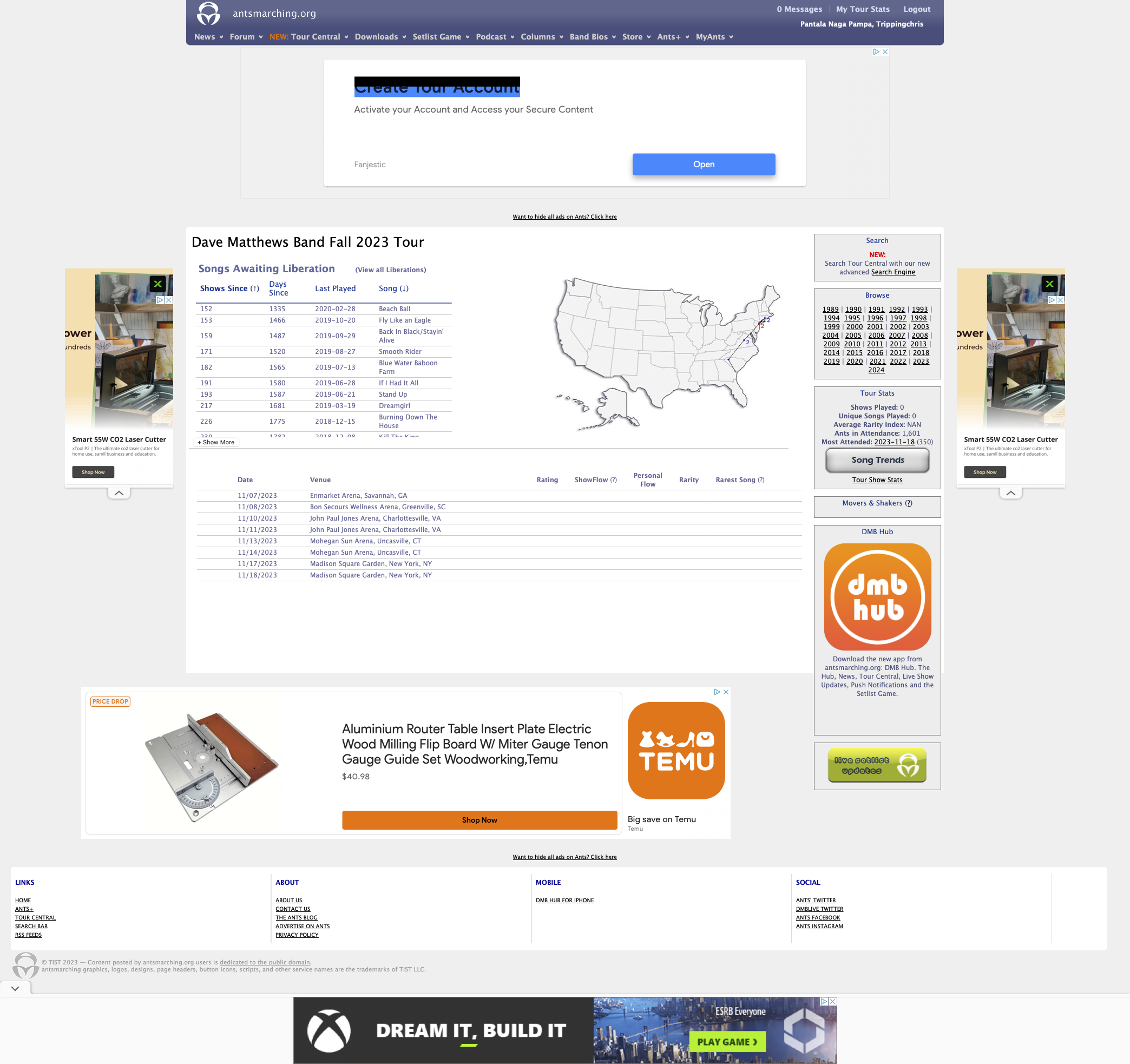
In the Tour Central section of the site, I was focused on featuring intricate content, encompassing tour details, show specifics, and a variety of data points and interactive elements. Given my passion for data visualization, these page types presented an exciting challenge. While my visual interests and skills have evolved since this project, and I would have explored additional avenues had I revisited it, this endeavor was, nonetheless, an enjoyable exercise.
The key themes I focused on for the Tour Central summary include:
- Enhanced Information Hierarchy: One focal point was to optimize the visual hierarchy of information. This entailed prioritizing high-level tour information at the top of the page, while providing further details regarding dates and venues towards the bottom
- Data-Driven Grouping: I organized summary information based on data points, incorporating color coding and iconography to emphasize specific data
- Intuitive Navigation: To enhance user experience, I grouped the functionality for searching tours by years into high-level categories. In hindsight, positioning this sub-navigation feature at the top of the page might have been more user-friendly
- Efficient Filtering: I streamlined the process of filtering tours by introducing options for viewing ‘All Shows’ or by tour type, such as ‘Summer Tour,’ ‘Fall Tour,’ or ‘Winter Tour’
- Optimized Touch Interaction: Recognizing the importance of mobile responsiveness, I increased the padding for table row elements related to Dates & Venues. This adaptation aimed to ensure a user-friendly touch target size, especially on mobile devices
- Promotion of Mobile App: Additionally, I incorporated a component dedicated to advertising the antsmarching.org mobile app, known as “DMB Hub”
Live Show Summary
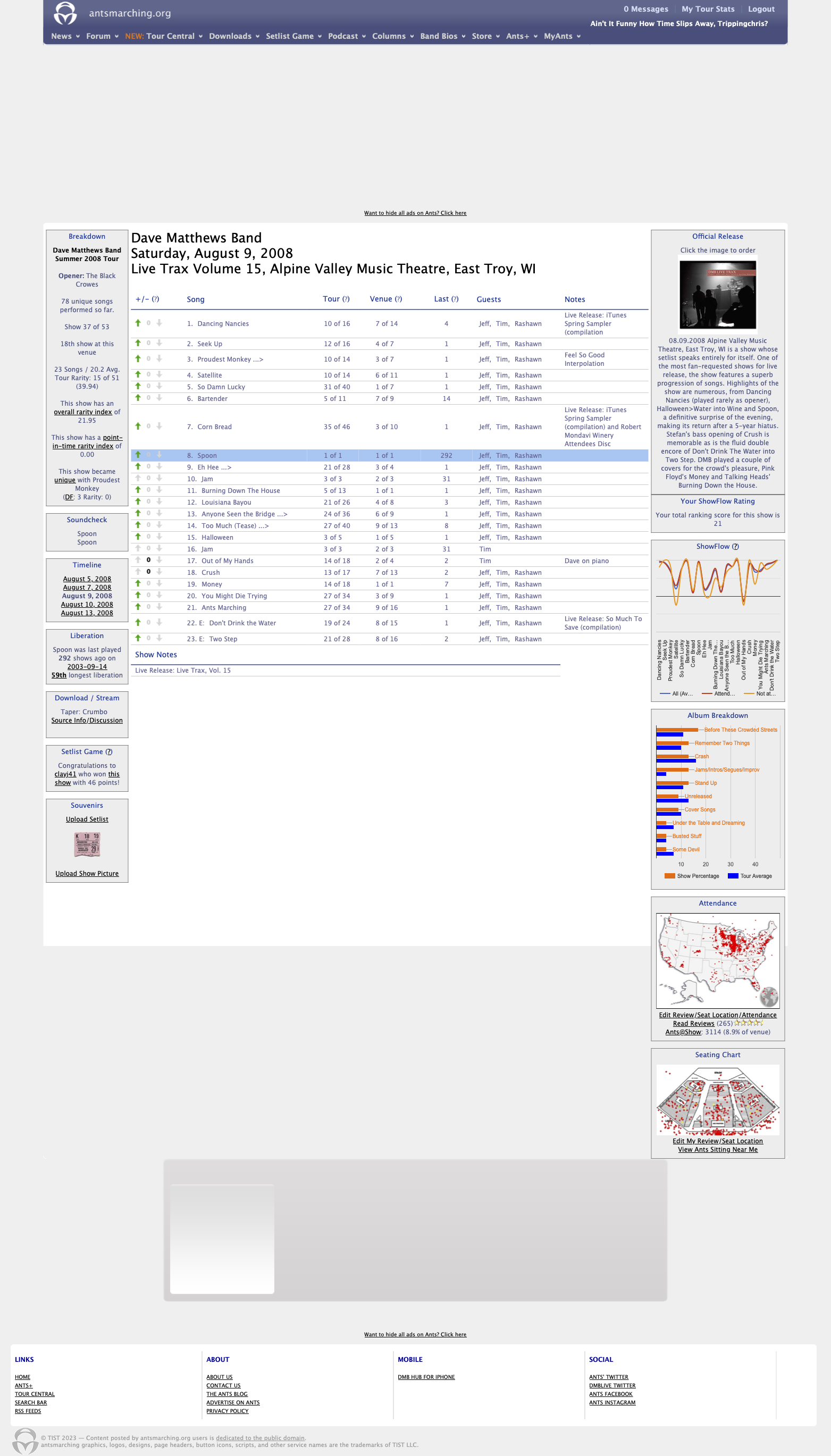
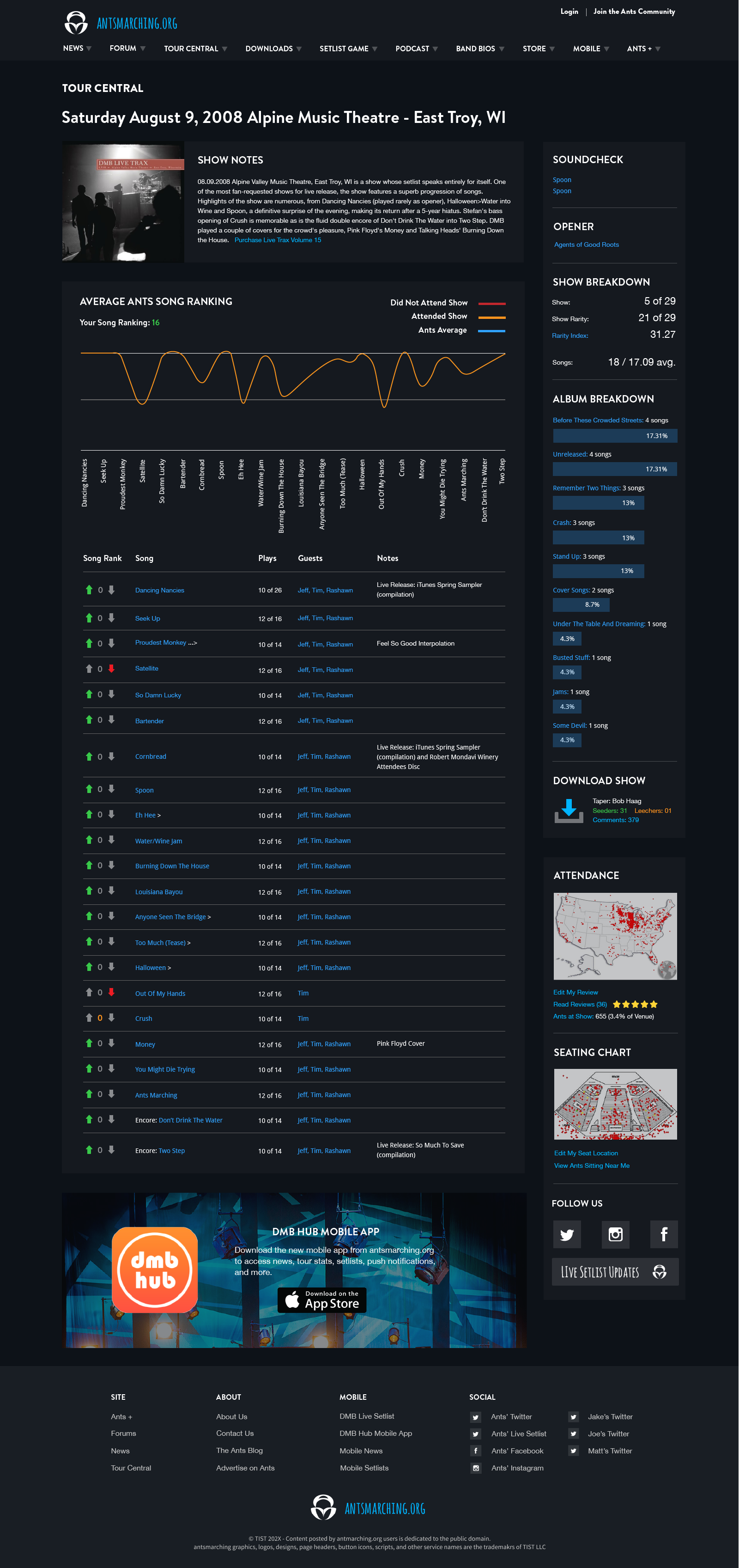
Venturing further into the Tour Central section, users encounter specific details pertaining to individual shows. This section, while presenting a similar data summary, revolves primarily around an interactive data visualization segment. Here, users have the opportunity to rate each song for a particular show, visualize the setlist flow, and witness a graphical representation of how votes align between users who attended the show compared to those who weren’t there.
The Show Summary section, with its unique blend of data visualization and user-friendly information presentation, represents a compelling milestone in my journey as a user experience designer, further enhancing my proficiency in delivering engaging and informative user experiences. Working on this segment was particularly gratifying, as it allowed for the integration of extensive data visualization with other pertinent information.
The key themes I focused on for the Show Summary include:
- Consistency with Tour Central: I ensured a seamless transition from the Tour Central section by maintaining a consistent theme, improving the content hierarchy, and employing clear headings and content groupings
- Emphasis on Primary Actions: The primary focus revolved around highlighting key actions on the page related to song voting and the display of results. This entailed prioritizing and creating ample space for these crucial data points
- Enhanced Touch Interaction: Recognizing the importance of touch interaction, especially within setlist tables, I improved touch target sizes to optimize user experience, especially on mobile devices
- Effective Use of Colors: I incorporated a color scheme to denote various elements on the page, differentiating data visualization components, interactive features, and hyperlinks, thereby improving visual clarity. This would be one area I’d want to revisit again as I wonder if certain color elements could be reduced, if necessary at all
- Clarity in Calls to Action: Lastly, I ensured clear and concise context around call-to-action elements, enhancing user guidance and usability
Lessons Learned
Reflecting on this experience, there are several valuable lessons I learned that significantly contributed to improving my skillset as a user experience designer:
Balancing Aesthetics and Functionality
I realized the importance of striking a balance between a visually appealing design and the functionality of a website. The need for fonts, colors, and elements to align with the site’s essence while ensuring they serve a practical purpose became clear.
Information Hierarchy with Multiple Content Types
The restructuring of the layout highlighted the importance of a well-organized information hierarchy. Categories, columns, and accessibility to supplemental information needed to be intelligently arranged for users to easily find what they were looking for.
Consistency and Cohesion
The design of a global header and footer showcased the significance of maintaining a consistent visual style and structure throughout a website, improving clarity and user experience. Meanwhile, components such as pagination for older news articles, grouping content into sub-navigation, and carrying visual themes across pages reinforced the necessity of providing users with convenient ways to navigate and access historical content.
Accessibility & Mobile Responsiveness
Improving touch target sizes, proper use of headings, use of colors to highlight key interactions was important to explore, creating designs that are accessible and user-friendly on various devices.
