E-Commerce Responsive Web
Warehouse Inventory Online
Enabling customers shopping online with Costco to specify warehouse and delivery locations to show inventory and fulfillment availability

Project Overview
This project held significant importance for the company as it ranked among the top priority of projects between 2021 and 2022. It marked the initial phase within a program to overhaul item fulfillment and inventory availability based on user-set locations within shopping user journeys.
Business Objectives
- Simplify fulfillment branding and pricing
- Reduce contacts to call center about inventory
- Drive traffic to website
- Show all available fulfillment channels
- Show inventory availability based on locations
- Show warehouse, delivery locations and settings
- Allow ability to search for nearby warehouse locations
- Ability to set a default warehouse & delivery locations
Primary Project Team
- Solution Architect
- Project Managers (2)
- Business Analysts (2)
- Developer Leads (2)
- QA Leads (2)
- UX Designers (2)
Stakeholders
- eComm Director & VPs
- Product Owner
- Product Buyers & Leadership
- Customer Support Leadership
Project Timeline
- Project Duration: 10 Months
- UX Duration: One Month
UX Overview & Challenges
My Role
As the lead designer, I was responsible for developing a UX strategy for the project, collaborating with my co-designer throughout the process, while managing our timeline and deliverables, presenting to stakeholders, and providing support through development and QA.
As business objectives were defined I worked with our Solution Architect to identify specific areas of impact on the website and, working with my co-designer, refined our strategy for research, design, and stakeholder reviews within a one month allotted duration for UX deliverables.
I was thrilled to contribute to this project as part of a team introducing Costco’s most requested feature while being able to emphasize Costco’s primary business model of driving in-warehouse traffic, and I was ready to uncover how members would behave and interact with during their Costco online shopping experience.
Tools Used
- Sketch
- Figma
- Figjam
- usertesting.com
- Baymard Institute
- Lucid Chart
- Microsoft Azure
- Google Suite
Challenges
- Quick research & design deadline (2 weeks + changes or other requests) once business objectives were defined, due to the high priority from the business to deliver an MVP for the project within the year (usually prior to or just after the holiday season).
- The list of nearby warehouse locations when a user changes their location was predetermined by stakeholders and our Solution Architect to display as a side drawer and to follow the same visual style as on our Find a Warehouse page. My co-designer and I explored alternative designs to explore different representations of content. Unfortunately, it was eliminated so development scope remained manageable.
- Some UX recommended features faced technical limitations, such as preventing the display of live inventory levels or location information on product listing page tiles (PLP). Additionally, the capability to view nearby location inventory levels on the product details page (PDP) was constrained and reserved for future efforts.
- Space limitations in the header for location setting content due to our 320px breakpoint for small devices, and already established content which would require a larger group of stakeholders and business areas if changed that would impact the project timeline substantially.
Research & Design Approach
Research was the first part of our work and there were a few things we needed and wanted to do in order to uncover possible design directions we could take.
Fortunately, our competitors had spent the last decade refining their own online shopping experiences regarding location and inventory levels, providing a valuable reference for us in our research approach and identifying best practices, current trends, and uncovering user behavior and expectations.

Best Practices & Competitive Analysis
Before delving into design concepts, I prioritized various research to inform and guide our approach, ensuring alignment with our stakeholder members’ needs. Collaborating with my co-designer, we crafted a research strategy.
Our initial step involved conducting competitive analysis, exploring eight major competitors as requested by stakeholders. Using Figma & Figjam for screen captures and creating detailed spreadsheets for research questions and features, we gained insights into industry practices. This process not only revealed current market trends but also identified potential gaps in our understanding, guiding us on areas to explore further during a usability study.
Additionally, I recommended utilizing the Baymard Institute to identify best practices and recommendations. Although their research didn’t specifically cover location and inventory relationships, it provided insights into certain aspects of location and inventory information for each page type. Notably, much of what we discovered through Baymard aligned with our findings from competitive research, offering a strong foundation to base our design concepts.
Competitive Analysis Spreadsheet
Competitive Analysis Captures with Figjam
Refined Competitive Analysis Captures for Presentation
Exploratory Usability Study
As soon as we gathered enough research on our own, we felt we had enough to organize an exploratory usability study to incorporate user feedback on their shopping behaviors and expectations when using location-based settings and their relationship with item fulfillment and inventory levels.
For this study, we selected Target, considering it as one of the retailers (Target, Best Buy, Home Depot) who had implemented features in a way that was appealing to the project team and stakeholders for what Costco could also implement. Utilizing Usertesting.com as our tool of choice, I led my co-designer and defined study plan goals, identified the user group (e.g., Target shoppers across various age groups), and crafted relevant scenarios and tasks. Eager to assist, my co-designer built the study involving 8 participants.

Key Questions We Sought to Understand
- How familiar are people with location-based settings and inventory levels?
- How important is the availability of location-based settings in their online shopping experience?
- In what situations is this information useful?
- How does the available of fulfillment options influence their purchasing decisions?
- What information is most important (e.g. product availability, inventory levels)?
- What challenges in the past have they encountered with location settings and inventory?
Key Findings from Participants
- Participants demonstrated a solid grasp of the concept of location-based inventory levels online as retailers had already honed and optimized similar journeys and features
- Expected global location setting within the header, enabling accurate search results, fulfillment options available for an item, and reflecting inventory levels accordingly
- While browsing, users sought high-level information on fulfillment options and inventory, with more detailed specifics available on product details pages
- Furthermore, as participants delved deeper into the product details page, they anticipated visibility of inventory levels at nearby locations
- Expected filter options to refine search or browse results based on fulfillment types or item availability.
-
Clear communication regarding fulfillment options, pricing, and location details was crucial
Costco Member Journey & Interactions
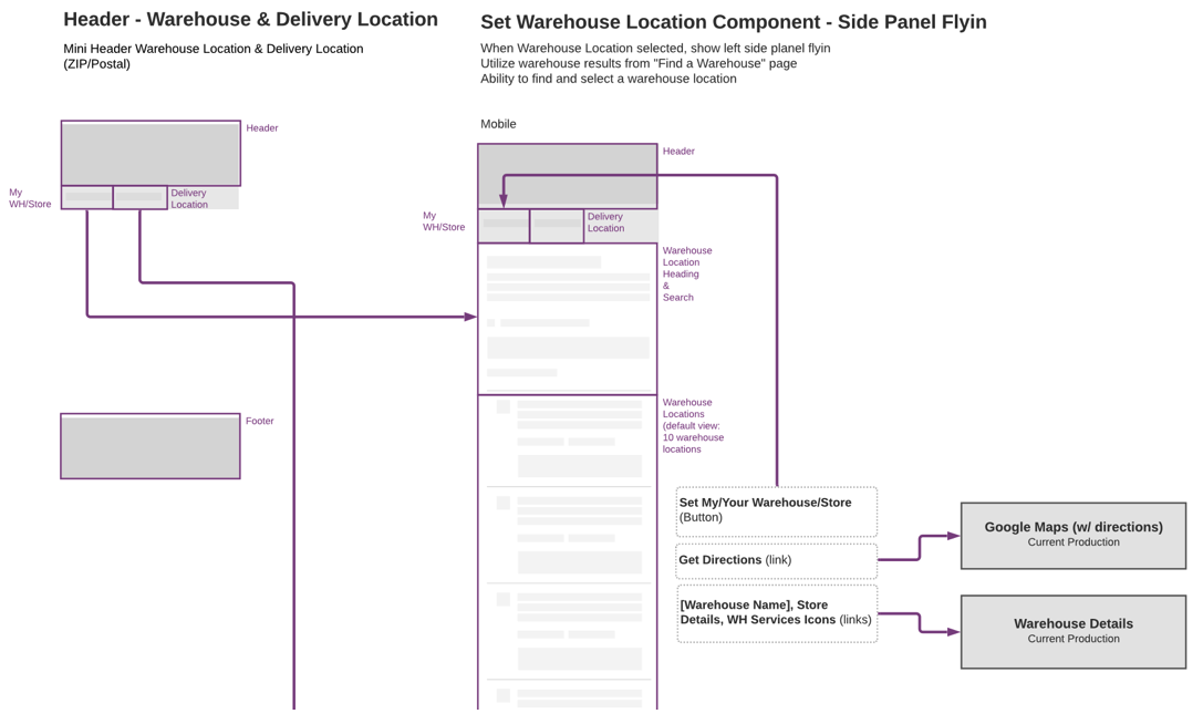
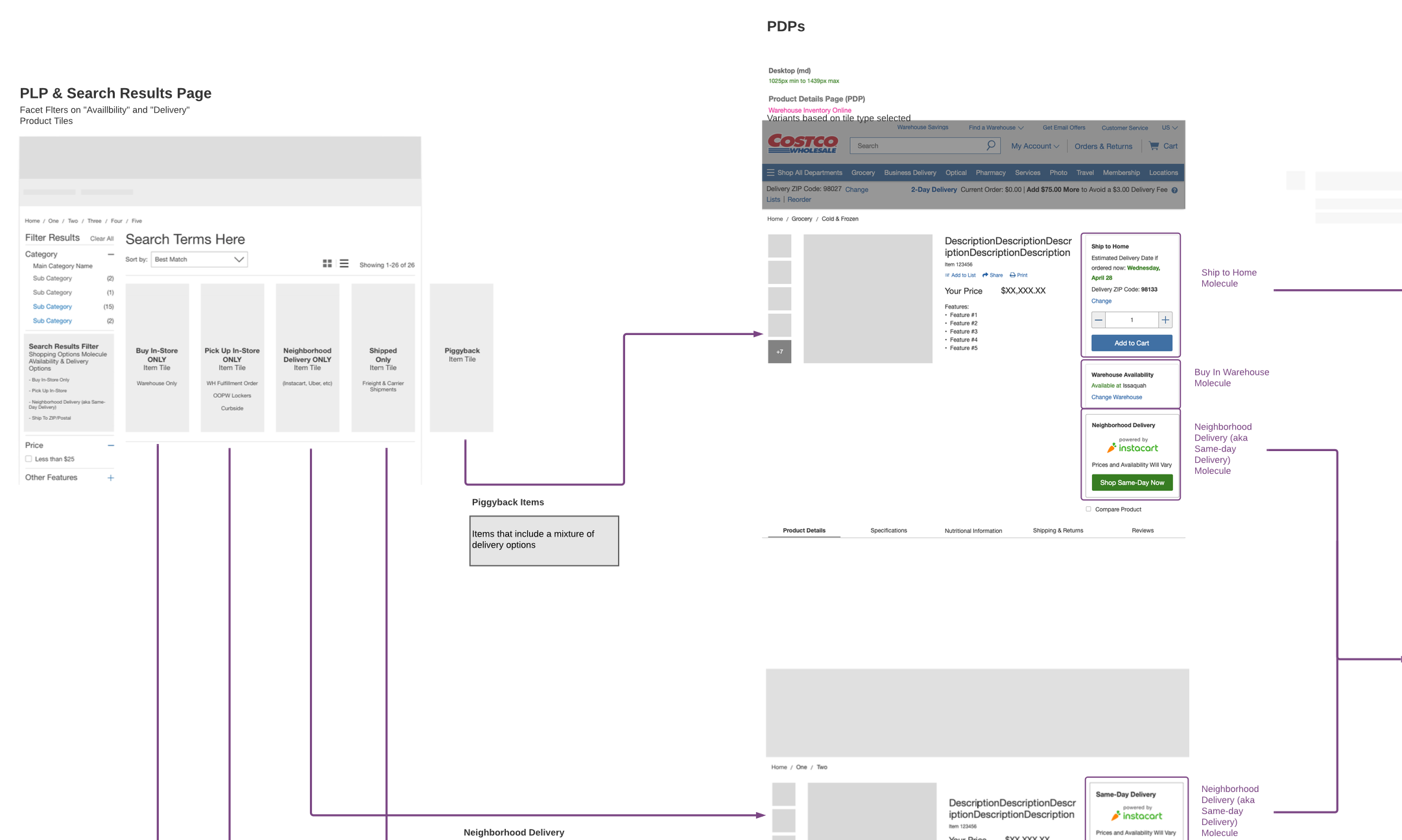
As we conducted research, and working with our technical team, my co-designer and I started to map out the user journey we were planning for Costco members.
I was responsible for mapping out Global Header location settings and the impact to search and the Product Listings Page (PLP), while my co-designer focused on documenting the journey and interactions of PLP item tiles and location and inventory levels on the Product Details Page (PDP).
At this point, as a request from our solution architect, we introduced early concepts of “skeletons”—content placeholders offering a preview of the page’s structure as it loads. While skeletons aimed to mitigate cognitive load by providing users with an idea of what to expect, they were later de-scoped from the project.
This level of documentation was critical in communicating our vision to both the technical team and stakeholders. It offered a high-level overview of how location-based settings would function and highlighted the specific areas of the site that would undergo changes. This approach, emphasizing clarity over detailed hi-fi designs at this early stage, facilitated ongoing discussions and empowered the development team to progress ahead of the final design concepts and stakeholder reviews.
Journey & Interactions from LucidChart
Exploring Design Concepts
Co-designer and I worked together to iterate concepts based on research and known requirements, breaking down proposed features we felt best represented our user base and business goals, in alignment with our research and design best practices for this type of customer journey.
In a collaborative effort, my teammate and I divided responsibilities, ensuring mutual support in our respective tasks. My focus was on refining location settings within the global header and establishing requirements for the Product Listing Page (PLP). My co-designer focused on location settings and integrating inventory levels on the Product Details Page (PDP). This division of tasks allowed us to navigate our bandwidth across other projects and sharing responsibility, maintaining a cohesive and supportive workflow.
Due to the scope of the project, focused on augmenting rather than overhauling the existing experience, our design iterations predominantly embraced medium to high-fidelity concepts, where our member journey and interaction mapping was used as lo-fi as possible to communicate the high-level view.
Examples of Concepts Explored
Usability Study with Costco Members
As my co-designer and I were wrapping up our design concepts, putting together what we believed to be optimal concepts for our members, we collaborated to plan a validation usability study. This involved deciding who would construct the prototype and lead the session using usertesting.com.
Our study included real Costco members, spanning various age groups, and adhered to the same study plan and scenarios from our earlier exploratory study with Target. Engaging eight new participants through usertesting.com, the results closely aligned with our initial findings. While we didn’t uncover new insights, the study validated that our recommended designs and features resonated with the expectations of online shoppers. Feeling confident in our proposal, we initiated the creation of a detailed presentation deck for stakeholders, covering our research, documentation, and the final proposed design concept.

Design Solutions & Reasoning
After working through various concepts, getting feedback from the larger UX team, and usability testing with Costco members, we landed on final concepts we presented to stakeholders for review and sign-off. The main areas of focus on the site our designs impacted include:
- Global Header & Locations
- Product Listings Page Filters & Item Tiles
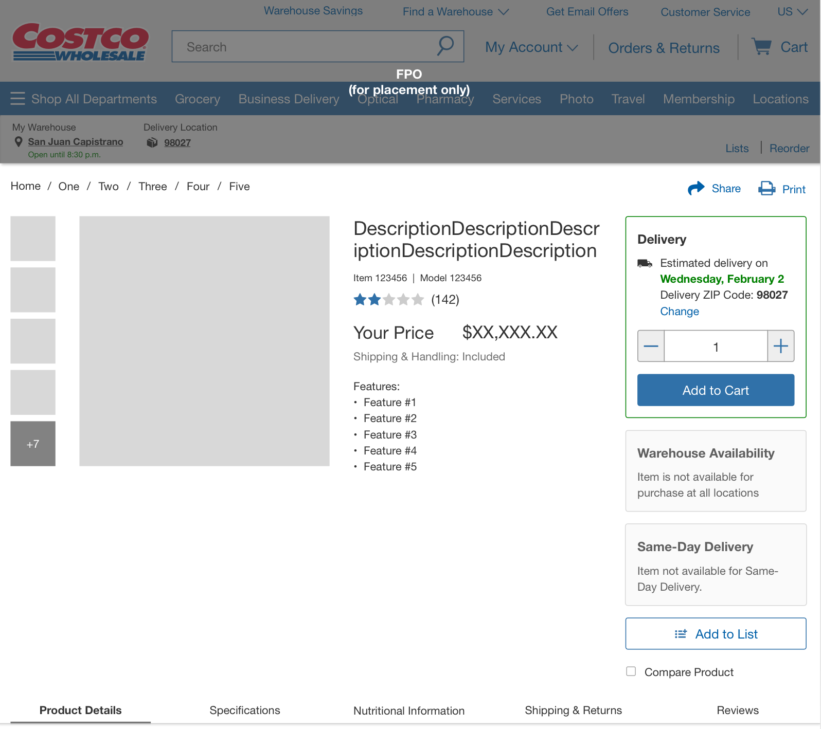
- Product Details Page with the display of available fulfillment options and warehouse inventory levels, as well the ability to change warehouse locations or view nearby location inventory levels directly within the page
Global Header & Locations
One of the major challenges we faced was the limited amount of space available within the header and mini-header, especially when considering the mobile breakpoint. In addition, any changes to the main header would require a large amount of stakeholder buy-in that existed outside of the scope of the project.
Based on our limited scope and quick timeline for the project, my co-designer and I made the decision to keep this information in the mini-header for now.
Global Locations for Warehouse and Delivery
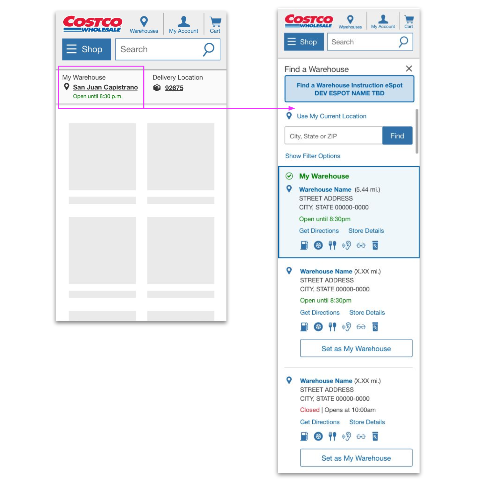
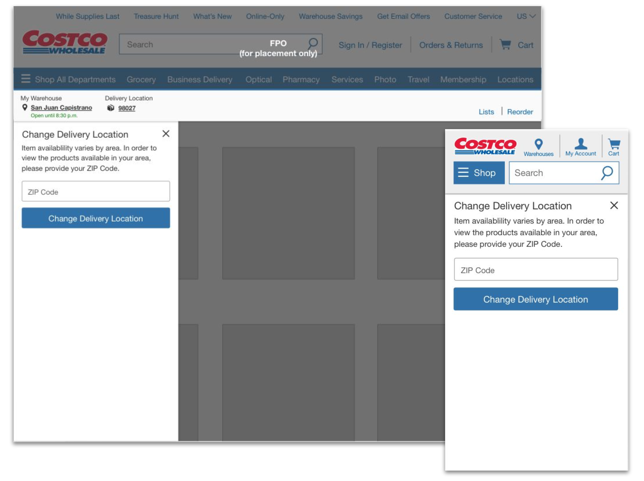
- Added “My Warehouse” location with time of next closure or opening
- Adjusted the “ZIP or Postal Code” label to “Delivery Location” to more accurately reflect setting and align terminology with “My Warehouse”
In our usability study, participants expressed a high expectation for global location information within the header. This included anticipations for details such as ZIP/postal code, and the city or store location name. Notably, some participants went further, expecting information on whether the store was open or closed, along with its hours of operation. Acknowledging these user expectations became pivotal in shaping our design decisions to align closely with the needs and preferences identified during the study.
Location Logic
Additionally, based on what we saw with competitors along with discussions with our technical team, the following logic was defined for how these location settings would work depending on what we new about the current site user.
- New or unknown users – session automatically detects my warehouse and delivery locations
- Returning user – Location information auto-displays based on previous session
- Locations can be different from each other because they each pertain to different item and fulfillment availability
Ability to Change Locations
As users interacted with location details, a drawer would slide from the left hand side of a screen presenting information to see nearby warehouse locations and the ability to select a warehouse to see inventory, or to adjust your “Delivery Location” ZIP or postal code.
We designed the drawer as the same size, utilizing the breakpoint at 320px. This provided ample enough space with content and created simplicity for development while keeping the component width consistent across all breakpoints
Product Listings Page (PLP)
There were two main areas of focus on the Product Listings Page (PLP) as people would browse or shop through the site:
- Filters to narrow down item results
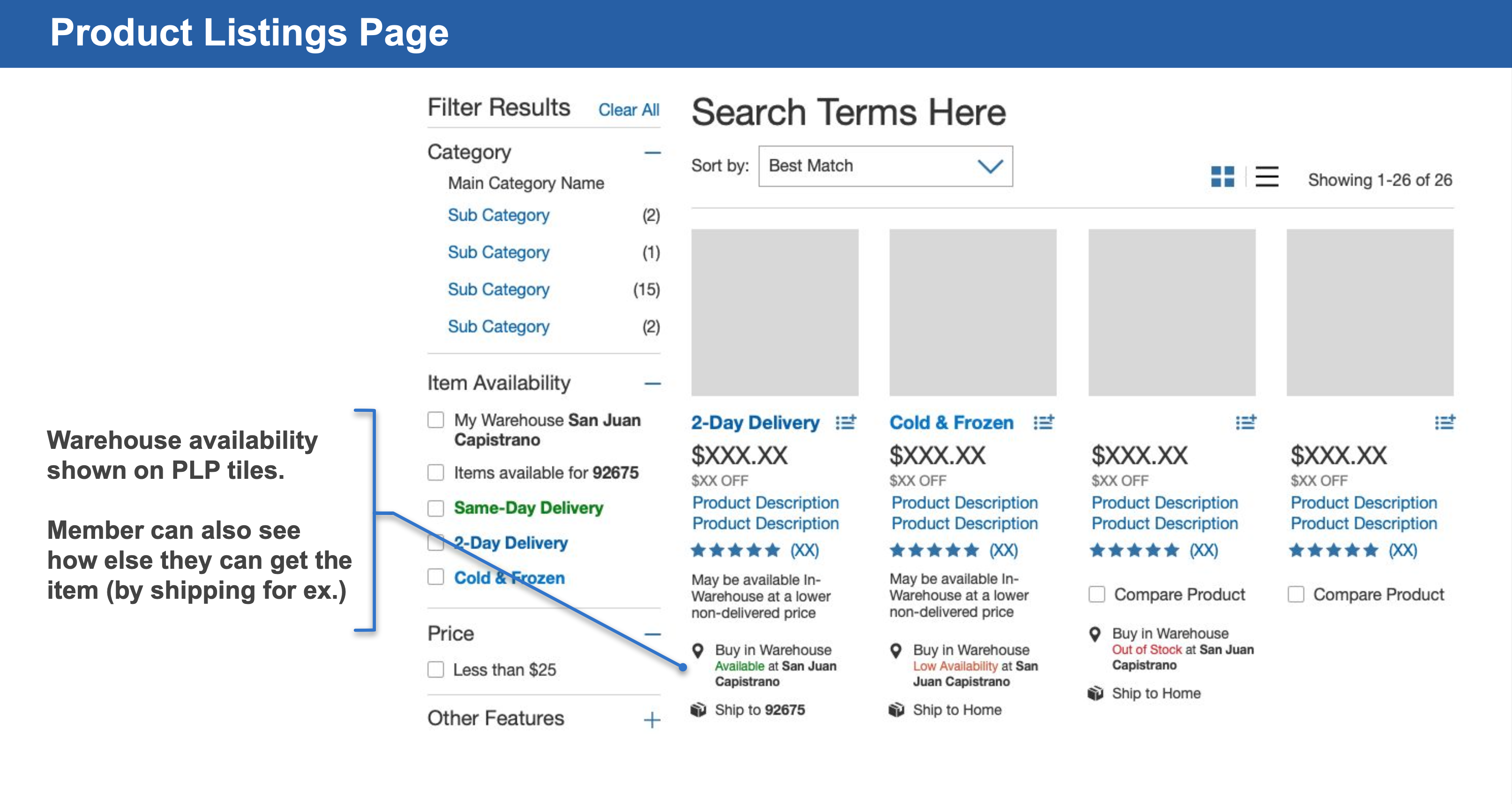
- Item tiles and the display of additional item-level information about fulfillment and inventory
Filter Options During Product Search
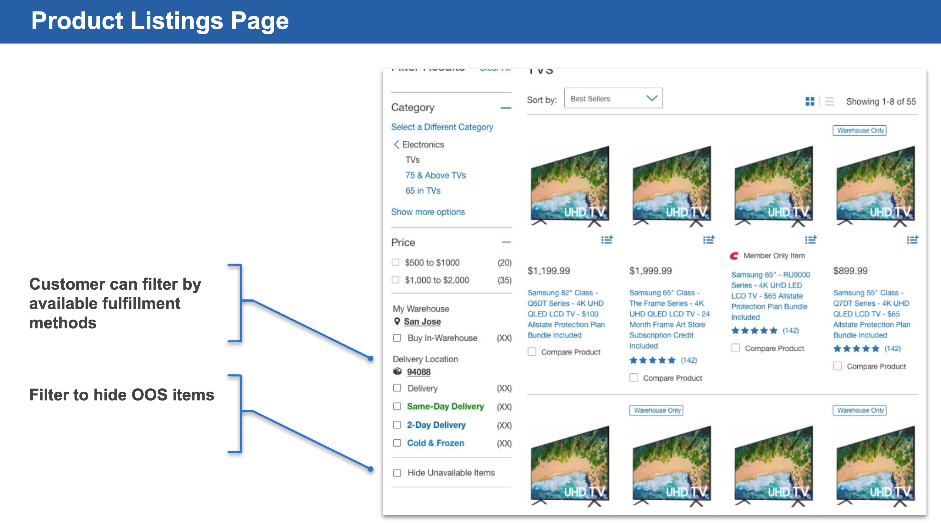
We added filter options by available fulfillment options, with an ability to hide unavailable items to reduce results. This is a common pattern we saw across retailers and participants in our usability studies provided feedback filter options are useful to them, especially if determining where an item may be available or is in stock.
To help our members understand how location settings impacted which filter options we decided to group filter options with the ability to change location settings directly within the filters. Changing a location invoked the same drawer UI pattern as in the global header, and updated global header locations as well.
Unfortunately, due to technical limitations and search performance concerns from stakeholders and the technical team, the ability to show inventory and location details on the item tiles was de-scoped. However, about a year after the project was implemented, there is a simplified version of this that was finally pushed to production.
Product Details Page (PDP)
Independent Scrolling
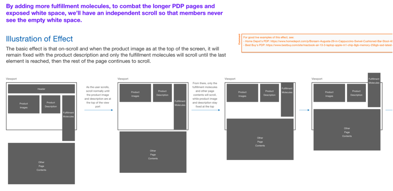
The fulfillment information along the right hand side would independently scroll if content was longer than the item summary at the top of the page. This would keep as much of the key content visible on larger displays, until the user was ready to move onto details lower on the page.
Warehouse Inventory & Same-Day Delivery Availability
As I mentioned earlier, scope was important for this project. Our research with some of the retailers (e.g. Best Buy, Target, Home Depot, Walmart) showed elegant solutions that were aligned with customer expectations regarding location, inventory, and fulfillment options.
In order to accomplish and align to current state of these retailers, scope for the project would have dramatically expanded in order to account for the large amount of PDP use cases we would have to account for with quite a few of stakeholder groups that would need to be included.
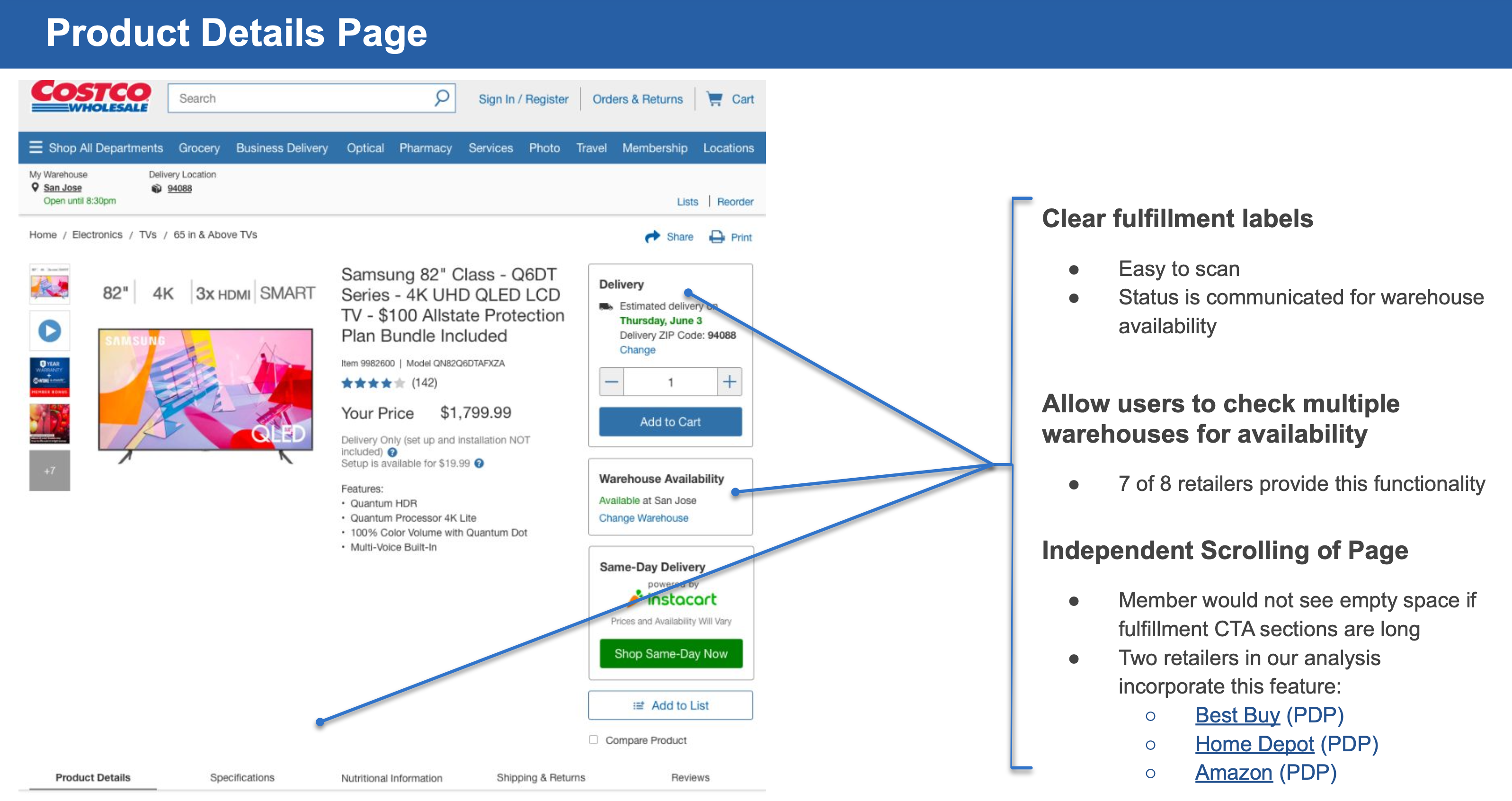
Keeping scope in mind, we opted for a concept that would bridge the gap to the next phases of the program that could scale. We utilized Target as our main example and decided to create two additional separate containers to add below the current “Delivery/Add to Cart” component already on the PDP.
One additional container stored warehouse inventory levels and selected warehouse, and the other container showed whether “Same-Day Delivery” was available, which would send users to one of our 3rd-party vendors managing grocery deliveries.
Costco usability study participants understood the design structure and were able to make sense of the information, and formulate conclusions on the information. One piece of feedback we received to help make each container of inventory stand out was to add heading information (Delivery, Warehouse Availability, Same-Day Delivery).
Additionally, our initial requirements were to only show available fulfillment options, however stakeholders requested to show all fulfillment blocks, and provide a state for each block if that fulfillment channel was unavailable. They also requested green colored outlines on the available fulfillment options. Later, it was determined to only show the available fulfillment channels for each item.
Impact on the Business & Users
Positive Impressions from Stakeholders and Users
This feature had consistently been one of the most requested by members during my time at Costco. The high demand really indicated its potential value to the member experience and overall business objectives. As I’ve noticed small feature recommendations from this project being implemented over time, it appears to resonate with Costco shoppers.
Future Phases Set for Success with Scalability & ROI
We delivered a successful implementation of features that allowed the project to deliver on-time, while creating the ability to scale outward as the next phases of the program progressed, and the ability to measure ROI after implementation and in later program initiatives (analytics tagging and checkout related).
My Lessons & Growth
UX Research Thoroughly Expanded Upon My Knowledge of Shopping Journeys
Throughout the extensive competitive and best practice research we conducted, I gained a profound understanding of the online browsing and shopping experience. It builds upon the insights gained from previous projects, including checkout and post-checkout journeys.
Emotional Intelligence & Resiliency During Ambiguity and Project Challenges Go a Long Way
Adversity is an inherent component of any project, with the specific stress points varying across different facets of a project team and stakeholders. I firmly believe in the significance of maintaining composure and being positive during moments of difficulty, diligently maneuvering to articulate the precise nature of any ambiguous issues pertaining to UX.
Mentoring while Leading Younger Designers Through Projects is a Balancing Act
Balancing the role of UX lead on projects while also mentoring younger designers involved in the same projects is a nuanced responsibility. As a lead, there is a duty to deliver consistent UX outputs aligned with stakeholder expectations, timelines, and quality standards, while simultaneously coaching and guiding younger designers within the project space. The mentorship aspect involves understanding the goals and aspirations of younger designers, providing guidance to help them define their path in alignment with their desired direction as designers, and creating opportunities for a sense of ownership in their work rather than strict direction.
Detailed UX Documentation Incredibly Important for Technical Teams
I’m always improving documentation details based on team standards to ensure designs are clear to anyone picking up a design file. This includes clear member journeys, interactions, and accessibility. Additionally, maturing experience with evolving design systems and the process of feeding UI changes back through the group responsible for maintaining these systems.


